HTML CSS SCSS Bem Vanilla Javascript Mobile firts

Solution retrospective
*I'm most proud of having built a fully responsive landing page using modular SCSS, with a design that respects the original mockups in both mobile and desktop versions. I also focused a lot on accessibility, incorporating aria-label attributes, avoiding position: fixed when necessary, and adjusting the tab order.
One of the things I liked the most was working with clamp() and min() to achieve a fluid design without relying exclusively on media queries.
Next time, I would like to better organize the SCSS files from the beginning and apply a clearer naming convention (like pure BEM ). I would also spend more time improving the HTML semantics from the beginning, making sure to use landmarks correctly (<main>, <nav>, <section>, etc.), which was a fix that I implemented in later stages of the project.*
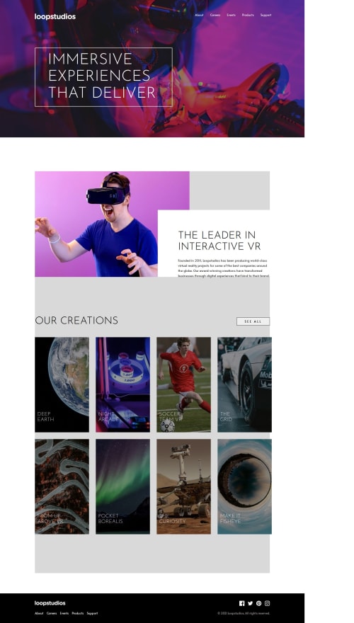
What challenges did you encounter, and how did you overcome them?One of the main challenges was managing the darkened background of the hero with ::before without covering the header content. Initially, the text appeared behind the filter, but I solved the issue by correctly adjusting the z-index and applying position: relative only to the necessary elements.
I also encountered issues with SCSS modularization using @use and @forward, particularly with missing imports or name conflicts. After reviewing the structure, I ensured that all files were properly connected using namespaces and organizing utilities, variables, and mixins correctly.
It was also challenging to make the mobile menu buttons accessible. I received warnings about buttons without visible labels or aria-label, so I added clear descriptions for screen readers.
In the future, I would spend more time improving HTML semantics from the start, making sure to use landmarks correctly (main, nav, section, etc.). This was a fix that I implemented in the later stages of the project.
What specific areas of your project would you like help with?El contenido y como estoy ordenndo todo con SCSS y la parte de accessibility
Please log in to post a comment
Log in with GitHubCommunity feedback
- @temesgen-982
First of all, the menu looks stunning on smaller devices👌 but you're supposed to align it horizontally on larger devices.
The other improvement you can consider is the grey background on the main area of the page because it is white (transparent) on the design file.
Your main.scss file is more than 500 lines, it is unsearchable (you are using & selector), and it may be difficult to look back into it later in time, so consider implementing the SCSS 7 in 1 architecture. Even I don't implement it fully, but it helps.Marked as helpful

Join our Discord community
Join thousands of Frontend Mentor community members taking the challenges, sharing resources, helping each other, and chatting about all things front-end!
Join our Discord