
Solution retrospective
Any feedback on the code's design, would appreciated.
Please log in to post a comment
Log in with GitHubCommunity feedback
- @grace-snow
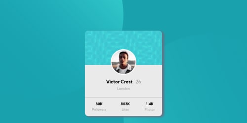
Hi, looks good. Just try to fix the shadow so it looks like the design, it's not very nice at the moment
- @Will-1-Am
Nice work. Something to look at would be the profile card sizing - the card can get very narrow if a browser is resized along its width. You should be able to prevent that from happening. The h2 and h3 headings don't really make sense as they have no children, so they could be replaced with something more appropriate. Additionally, h1 is not in use in the HTML, so h2 and h3 shouldn't be in use. I hope that helps and good luck with your coding!


Join our Discord community
Join thousands of Frontend Mentor community members taking the challenges, sharing resources, helping each other, and chatting about all things front-end!
Join our Discord