HTML + CSS using grid

Solution retrospective
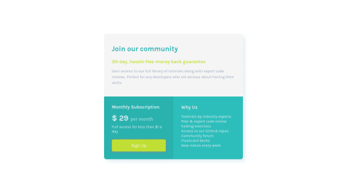
How can i remove the whitespace, on the bottom, on the two last divs( monthly subscription and why us) which appears on smaller devices?
Please log in to post a comment
Log in with GitHubCommunity feedback
- @janegca
Hi Marcin, if you take at look at the layout using the WebDev tools you can see the extra spacing in the smaller layout is coming from the 'grid-template-rows: 1fr 1fr 1fr' setting (all the grid cells are being given the same size). Try changing it to '1fr auto auto' for the smaller layout and the two bottom rows should size to their content.
Hope that helps. Nice job overall :)
- @yadprab
Hey, the problem is because of grid-template-rows: 1fr 1fr 1fr; fr unit always takes up the free space use fr for large contents. Always use auto so it adjusts itself according the content Replace grid-template-rows: 1f auto auto;
Use firefox grid inspector it will help you to find the problem
Great job Keep learning 😊
- @ApplePieGiraffe
Hi there, Marcin! 👋
Good job on this challenge! 👏 Your solution looks pretty good and is responsive! 👍
A few things I'd like to suggest are,
- Adding a hover state to the button.
- Adding the light blue background color from the original design would be a nice touch, I think.
- I think giving the card component a fixed width in the desktop layout and simply changing its width for the mobile layout of the site using a media query would be a good idea for this challenge to ensure that there's always plenty of room for the content inside the card component in the desktop layout. Just a tip! 😉
Keep coding (and happy coding, too)! 😁


Join our Discord community
Join thousands of Frontend Mentor community members taking the challenges, sharing resources, helping each other, and chatting about all things front-end!
Join our Discord