HTML CSS3 SASS BEM

Solution retrospective
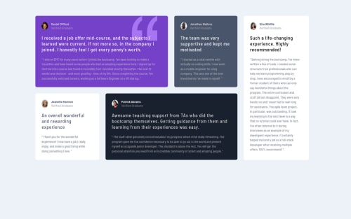
Hello, as usual please send me any remarks on anything that you think I can improve either for the layout or the code itself? Tell me if my solution is valid... I have one thing to note though, I had some trouble with the two white testimonial components. The padding for the desktop layout for both components do not seem to look exactly like the mockup I downloaded. The padding I used for all components are the same for both mobile and desktop layouts. I don't understand why when compared to the mockup, the two white components in my solution looks like it has more padding-bottom than the mockup. I am not sure if it s my eyes or am I being too perfectionist!! Can anyone propose a solution for this or would this small difference be accepted in real life work? Or am I just having an optic illusion and there is nothing wrong with it lol lol?? Again, thank you in advance for anyone taking the time to look at my solution and answering my questions!!
Please log in to post a comment
Log in with GitHubCommunity feedback
No feedback yet. Be the first to give feedback on Jaonary Andritiana's solution.
Join our Discord community
Join thousands of Frontend Mentor community members taking the challenges, sharing resources, helping each other, and chatting about all things front-end!
Join our Discord