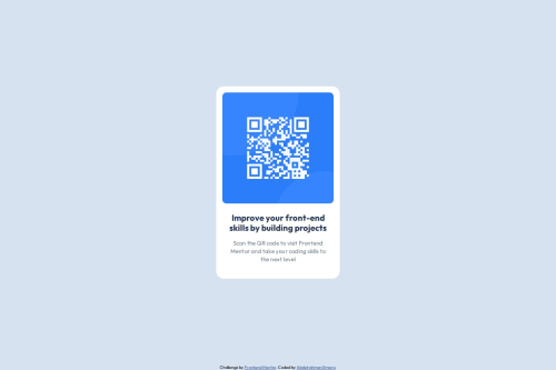
QR-Code Component using HTML, CSS, and Vercel Deployment

Solution retrospective
I'm proud of using CSS Variables and using Semantic HTML, where I brokedown the design into different <div> tags, to control styling the different HTML elements. This helped me to overcome my fears.
I had a little challenge of putting the QR-Code component in the middle of the body element.
I managed to overcome this, by using Flexbox and the flex-direction property was set with the column value, and finally, applied the justify-content and align-items properties to be at center.
I would like to know if there was a better way to structure my HTML code, and if any header level would be used for the first sentence used in the QR-code component.
Also, I used CSS Variables and tried my best in styling the component, but I feel there always could be better. Are there any guides or rules to follow that I've missed in my approach to style the HTML elements? Could they be less verbose, if applicable?
Please log in to post a comment
Log in with GitHubCommunity feedback
No feedback yet. Be the first to give feedback on Abdelrahman Emara’s solution.
Join our Discord community
Join thousands of Frontend Mentor community members taking the challenges, sharing resources, helping each other, and chatting about all things front-end!
Join our Discord