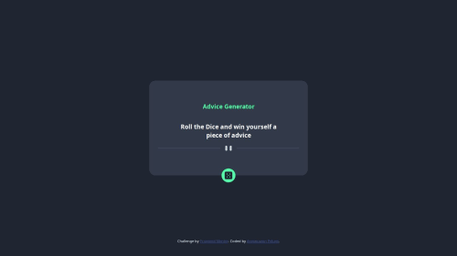
HTML, style and Responsiveness on all device using vanilla CSS, JS

Solution retrospective
I'm proud of the fact that I was able to use an api and fetch it from my function, this is my first time working with an api call in a project and it has enlightened me a bit on the basics of it.
What challenges did you encounter, and how did you overcome them?I had a litte issue figuring out how exactly to use the api in my project, but after making some research I figured out how to implement the api in my project and it worked just fine.
What specific areas of your project would you like help with?I would like to get more knowledge on api, and when and how to use them effectively in my project. I would also like to learn more about the asynchronous function and how to use it effcetively.
Please log in to post a comment
Log in with GitHubCommunity feedback
- @khatri2002
Hi @lilprof01!
The developed solution looks great! The animation applied while changing the advice text is very impressive and enhances the overall user experience!
Below are a few suggestions for improvement, aligning with standard practices and ensuring the component is robust and user-friendly.
Prevent Multiple API Requests
Currently, the button can be clicked multiple times, triggering multiple API requests before the previous one completes. This could lead to server flooding. To prevent this, disable the button while the request is pending and enable it again once the request is resolved.
Update the Button State During API Calls
button.addEventListener("click", async () => {
    button.disabled = true; // Disable button
    try {
        ...
    }
    catch(error) {
        ...
    }
    finally {
        button.disabled = false; // Re-enable button
    }
);
Style the Disabled Button
To provide visual feedback to users, use the CSS
:disabledselector to style the button when it is disabled.For example:
button:disabled {
    background-color: #ccc;
    cursor: not-allowed;
    opacity: 0.7;
}
Refine Hover Effect with
:hover:enabledSelectorCurrently, the hover effect applies even when the button is disabled, which might confuse users. To ensure the hover effect is only triggered when the button is enabled, update the hover selector as follows:
.advice-button:hover:enabled {
    ...
}
Excellent work so far! 🚀

Join our Discord community
Join thousands of Frontend Mentor community members taking the challenges, sharing resources, helping each other, and chatting about all things front-end!
Join our Discord