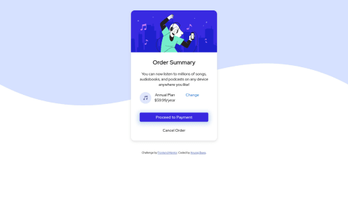
HTML5, CSS3, Atom

Solution retrospective
I've used basic HTML and CSS to create the Order Summary Card. I would be glad to know the improvements in terms of best practices, or better approaches or anything else which would help improve an end user's experience with the page. Please feel free to provide your comments and suggestions on the code as well as UI. Thanks and Regards Anurag Bawa
Please log in to post a comment
Log in with GitHubCommunity feedback
- @ChamuMutezva
- a span (an inline ) element should not be a parent to a div (block element)
- the following should be an interactive element , it looks like it should be an
anchor
element not a div element. A div has no semantic meaning and should not be used over a more suitable element, it can be improved though by use of aria attributes.
<div class="cancel-order"> Cancel Order </div>
Well done and congratulations for completing your first challenge, you have to work on the responsive aspect for mobile viewers who happens to be the majority of viewers. Here are some changes that you might need to effect ,you will have to adjust accordingly with design
- on the body element set some padding to have some breathing space between the body and the content.
body { background-image: url("images/pattern-background-desktop.svg"); background-repeat: no-repeat; background-size: auto; text-align: center; font-family: 'Red Hat Display', sans-serif; cursor: auto; padding: 3rem 1.5rem; // add padding here, adjust accordingly to design }
- card. the current code is the following . we are going to make a few changes to it
.card { width: 25%; // remove this - see next code margin: 3% auto; //see updated code below border-radius: 15px 15px; box-shadow: 1px 4px 10px rgba(211,211,211,0.4),-1px 4px 10px rgba(211,211,211,0.4); background-color: white; }
- i have changed the
width
tomax-width
andmargin
to be only auto
.card { max-width: 25rem; //new values margin: auto; //new values border-radius: 15px 15px; box-shadow: 1px 4px 10px rgba(211,211,211,0.4),-1px 4px 10px rgba(211,211,211,0.4); background-color: white; }
This should give a solution that is a bit responsive from small devices to large screens
Good lucky and happy coding
Marked as helpful - @afrussel
As your first challenge its good. Background image is missing. Use this below code for bg image
body{ background-color: var(--pale-blue); background-image: url("images/pattern-background-desktop.svg"); background-repeat: no-repeat; background-size: 100% 50%; display: -ms-grid; display: grid; -webkit-box-pack: center; -ms-flex-pack: center; justify-content: center; -ms-flex-line-pack: center; align-content: center; }
Marked as helpful
Join our Discord community
Join thousands of Frontend Mentor community members taking the challenges, sharing resources, helping each other, and chatting about all things front-end!
Join our Discord