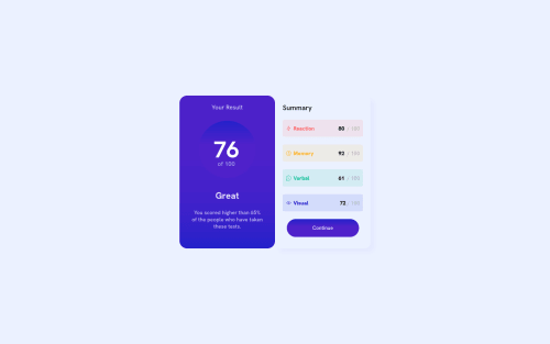
Not Found
Not Found
Not Found
Not Found
Not Found
Not Found
Not Found
Not Found
Not Found
Not Found
Not Found
Not Found
Not Found
Not Found
Not Found
Not Found
Not Found
Not Found
Not Found
Not Found

Submitted

HTML5 + CSS3 RESPONSIVE

#accessibility
Túlio 50

@tuliovini13

Desktop design screenshot for the Results summary component coding challenge

This is a solution for...

  • HTML
  • CSS
1newbie
View challenge

Design comparison


SolutionDesign

Solution retrospective


Yo guys, Thats my project that I spend 5 hours of my day hahaha I've too dificult to make the widths, I wanna help about this. I dont know how can I change widths EASIly, like change the left and right card's widths.

Community feedback

@YariMorcus

Posted

Hi Túlio,

First of all, I think you did a great job on the challenge. The component is responsive and almost looks like the design (you forgot to add a white background to the result2 section).

The only thing I noticed beside the above is that your favicon is not working (due to an incorrect path, you can see this in the JS console).

To give you an answer to your question

You can change widths more easily by not only using percentages (which you have done already), but also by using CSS Grid Layout.

Alternative method with Grid Layout

  1. On larger screens (use a media query for this): on div.card, use display: grid instead of flex, and use grid-template-columns: 1fr 1fr;. This creates a grid formatting context (grid container) in which you can create your custom layout. In this case, a two column layout. The two column layout is then achieved with grid-template-columns: 1fr 1fr;, which basically says: create two columns of the same size. 1fr 1fr is here equal to 50% 50%.
  2. Remove width: 100% on both section.result and section.result2.
  3. Remove width: 500px on <main> and put max-width: 500px; on div.card instead. I also advice this when you use flexbox. The main reason for it is because it is a componen, which should be able to be reused on multiple pages (without setting width: 500px: on <main> all the time, because this can break your entire layout if you have other things on the webpage as well (but this is something for later on).

If you do the above, you will see that it will give you the exact same result.

I you want to learn more about Grid, then you can follow a crash course (Traversy Media) if you'd like.

Flexbox variant (which you currently use)

Instead of putting width: 100%; on both div.result and div.result2, you could have placed flex: 1; on both div.result and div.result2.

Flex: 1; says: create two flex items of the same size (50% 50% because you have two flex items in your div.card container (flex container)).

I hope you can do something with this, but if you still have questions, let me know. Don't see it as something you need to do, but rather something for later (you are always free to correct your solution).

If I made a mistake somewhere in this post, feel free to correct me and keep building awesome things :D.

Marked as helpful

1

Túlio 50

@tuliovini13

Posted

@YariMorcus Thanks so much for your feedback, thats makes me too happy. Thanks for dedicate your time to help me, I'll do my better to absorb the maximum. Have a good day :)

1
Túlio 50

@tuliovini13

Posted

@YariMorcus You are correct, I just know abot Flex Boxes hahaha, i'll learn more about the GRID BOXES, thanks

1

Please log in to post a comment

Log in with GitHub
Discord logo

Join our Discord community

Join thousands of Frontend Mentor community members taking the challenges, sharing resources, helping each other, and chatting about all things front-end!

Join our Discord