@pikapikamart
Posted
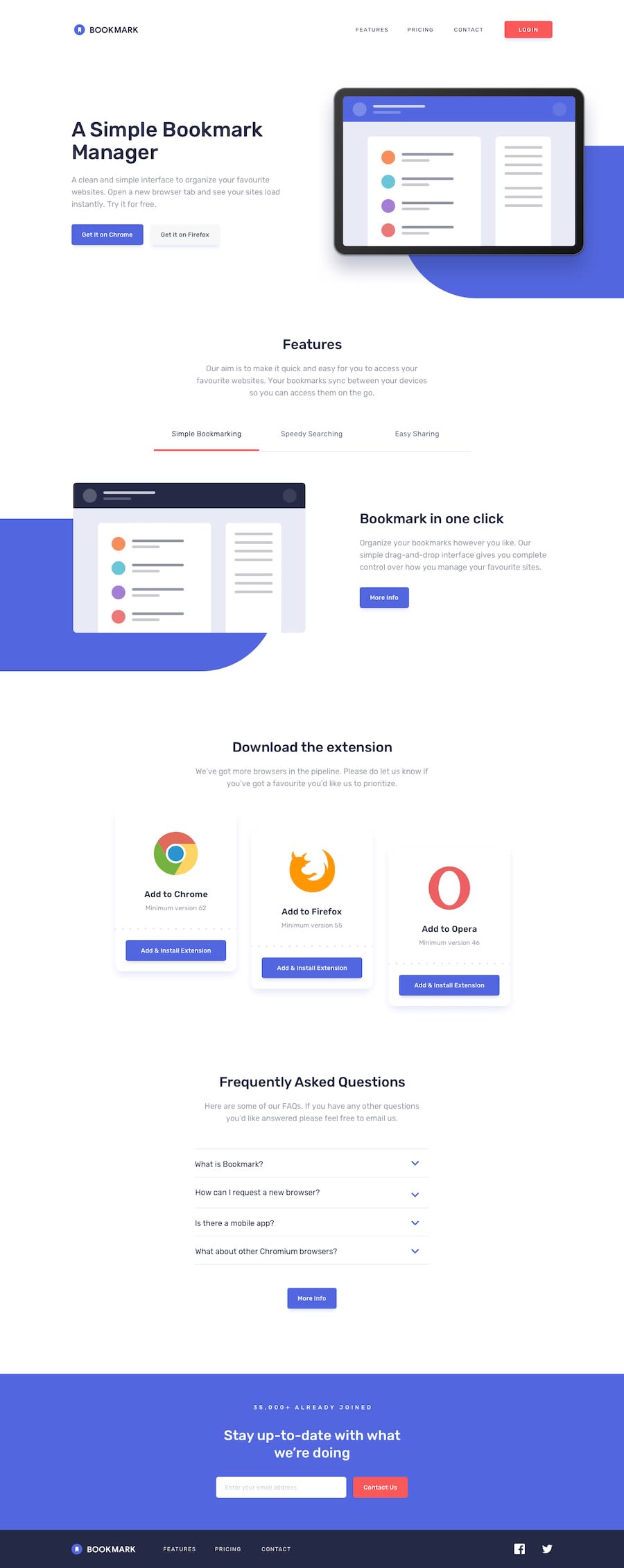
Hey, great work on this one. As Shanin said, on desktop layout, the hero-section seems too squeezed. In mobile layout, some sections were also squeezed and some elements needs to be resized.
Addition to what Shanin said:
- I wouldn't include the
headerbookmark logo in thenavsince you are not treating the website logo as a link, better to separate it from thenav. - The
alttext of theheaderlogo should have beenalt='bookmark". The logo itself have the name as thealtvalue, also when usingaltattribute, do not include any word that relates to "graphic" like "logo, icon, image". Assistive tech will handle those for you. - The list of links in the
headeris the one thatnavneeds to nest. - On the
headeron theulelement, do not put any other html element inside it, unless it is nested inside li:
<ul>
  <li></li>
  # do not use any other html element unless it is <li />
</ul>
- The login should have used
atag since it is being treated as a link in the navlinks. - You are missing an
h1element. Every webpage should at least contain 1h1element. The heading tag in your hero-section could have been theh1. - It is good that you are trying to implement
tabbed interfacein the features section, however right now, it is not usable. You forgot to add the javascript that moves the focus from the selected tab to another one using arrow-keys. You can see my solution and inspect it and go to the sources, you will see how I implemented mytabbed interface. - The
aria-selectedattribute is not applicable todivalone. You should use it insidebuttonelement that are selected by the user in thetabbed interface. - It is good that you added
tabindex="-1"on the selected feature container, however, maybe customized theoutline:>. - "more info" should have been a
atag since it is being treated as a link to view "more info". altvalue of the browserimgshould only contain their name and lose the word "logo".- "more info" in
faqsection should have usedatag as well. - "Stay up-to-date with what we're doing" text in the
ctasection should have been a heading tag, since it is a topic title for the email subscription. - On the
inputin thectasection, you might want to move the stylings from the:focusto:focus-visible. - The
input type="submit"could have used abutton type="submit". The latter one is not recommended now, I think. Also, having acursor: pointeron the desktop state as well would be really good. - Now, as you can see, the error appears visually when a user submitted a wrong email, to provide more accessibility especially for people who only uses screen readers. It would be great to add
aria-invalidandaria-describedByon theinputelement if the user submit it wrong. Let me create a pseudocode:
const email = query the email input;
const error = query the email error text;

if ( email is invalid) {
  email.setAttribute("aria-invalid", "true");
  email.setAttribute("aria-describedBy", "id of the error message element"); # binds
  error.make it appear
} else {
  email.removeAttribute("aria-invalid");
  email.removeAttribute("aria-describedBy");
  error.hide it
}
Using aria-invalid and aria-describedBy, this will create a guidance for screen reader users, knowing that they submitted a wrong email input. It would be great to make an element have a aria-live attribute to make it even more accessible.
MOBILE
- The hamburger menu
buttonshould have been the one triggering the dropdown event. Right now, I can't use my keyboard to toggle it, that is why put the event on thebutton. - The
buttonas well for the hamburger dropdown should usearia-expandedattribute, to inform the user that the dropdown has appeared. - The
buttonas well should have thearia-labeland thealttext for theimginside thebuttonremove all of those, you only need 1 and it must be on thebuttonelement. - On the dropdown, the social media links should be wrapped inside a
atag. They are links right, better to useatag witharia-labelon them. - Lastly, you might want to check the layout in mobile flow. There are elements that are not really good to look, since the widths, they overflow, and other. Check those one out.
Still, you did a great job on this one.
Marked as helpful
@simretB05
Posted
@pikamart thank you for the feedback!!

