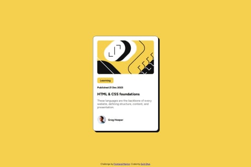
HTML5: For the structure of the webpage CSS3: For styling the card and

Please log in to post a comment
Log in with GitHubCommunity feedback
- @slayer-br
Hi sujitdhar014, great job putting together this solution! 🌟 Here's some feedback that might help you refine it further:
✅ What’s Working Well: Clean structure: The code is well-organized and easy to follow, with clear use of classes and spacing. Nice use of CSS variables for colors!
Typography & color usage: The font, weights, and color palette closely match the design spec and create a polished look.
Responsiveness: The layout adapts reasonably well for small screens thanks to the centered flexbox approach and max-width. Good use of padding for spacing!
🧠 Suggestions for Improvement:
- Semantic HTML: Consider replacing the <div id="container"> with a more semantic element like <article>, since this is a blog card. Similarly, the publication date in <h3> could be a <time> element with a datetime attribute.
The button labeled "Learning" is used more like a label/tag, so a <span> or <p> with appropriate styling would be more semantically correct than a <button>.
- Accessibility: The main image (illustration-article.svg) has an empty alt attribute. If it’s decorative, that’s fine, but consider clarifying intent. If it's informative, include descriptive alt text.
For better screen reader support, consider using landmarks (like <main> or <section>) and ensure all text content is clearly structured for accessibility tools.
- Layout and Responsiveness: The layout works well on mobile-sized screens, but consider testing at larger breakpoints (like tablets or small laptops). The fixed width might feel a bit narrow on wider screens. A media query with max-width: 600px and some scaling adjustments could help.
Also, adding hover or focus states for interactive elements (like the button, even if changed to a span) would improve usability.
- Code Reusability & Readability: You did a great job keeping the styles modular. One small improvement could be breaking the styles into sections or using comments to separate major areas (e.g., layout, typography, components).
You might also consider using class-based styles for structure instead of relying on selectors like #container img:first-child, which can be harder to scale.
- Design Accuracy: The general design is very close! One small tweak might be in font sizing and line height for better readability and closer alignment to the original. Also, spacing around the author section could be fine-tuned to better match the mockup.
✨ Overall, this is a solid implementation with good attention to detail. With a few adjustments to semantics and accessibility, you’ll be on track to a more robust and production-ready solution. Great work! Keep it up! 🚀

Join our Discord community
Join thousands of Frontend Mentor community members taking the challenges, sharing resources, helping each other, and chatting about all things front-end!
Join our Discord