HTML5 + SCSS Level up! Clean and efficient code!

Solution retrospective
- FLUID responsiveness (layout and fonts)
- well structured and organized code
- good accessibility
- pixel-pretty-close
- @font-face integration
- SEMANTIC html, scss, vanillaJS
What is your opinion, especially on the the HTML5 markup on the .testimonial-card? Note: I've used '.author-container' in order to place the author's avatar within its pseudeo-element ::before. Is there anything, in your mind, to improve the structure/ organization in the code?
As always, I appreciate ANY kind of feedback :)
Special thanks to @pikamart, who helped me with his feedback on the previous challenge. This community is awesome.
Please log in to post a comment
Log in with GitHubCommunity feedback
- @pikapikamart
Hey, really awesome work as well on this one. Desktop layout is really great, it is responsive and the mobile state looks really great as well.
Some suggestions would be:
- For a fluid layout, I always use this function that I created in scss:
# I separate this module
@use "sass:math";

@function rem($px) {
  $value: math.div($px, 16) + rem;
  @return $value;
}

@function fluid($min, $pref, $max) {
  $size: clamp(#{rem($min)}, #{$pref}, #{rem($max)});
  @return $size;
}
And on any properties that requires number value, I could just use like: link to my scss structuring
#
@use "_functions.scss" as func;

font-size: func.fluid(16, 1.4vw, 18;
padding: func.fluid(32, 7vw, 56) func.fluid(48, 17vw, 80);
margin: ...
max-height:...
Though you will need to use the dev tools a lot to get the proper preferred size, the middle one value. I kept it as close to the original clamp.
- Website-logo- link
atag should either usearia-labelor screen-reader only text inside it, that defines where this link would take the user. Since typically a website-logo links to homepage, use "homepage" as the value for what ever method you will use. - On your logo-svg, you should do it this way for the
titleto work properly.
<svg aria-describedBy="logosvg">
  <title id="logosvg"> fylo </title>
  the rest of the svg code
</svg>
Though I prefer using
svgas thesrcvalue for theimgso that I will just have to usealt.- Another idea is to create your own visual indicator like this:
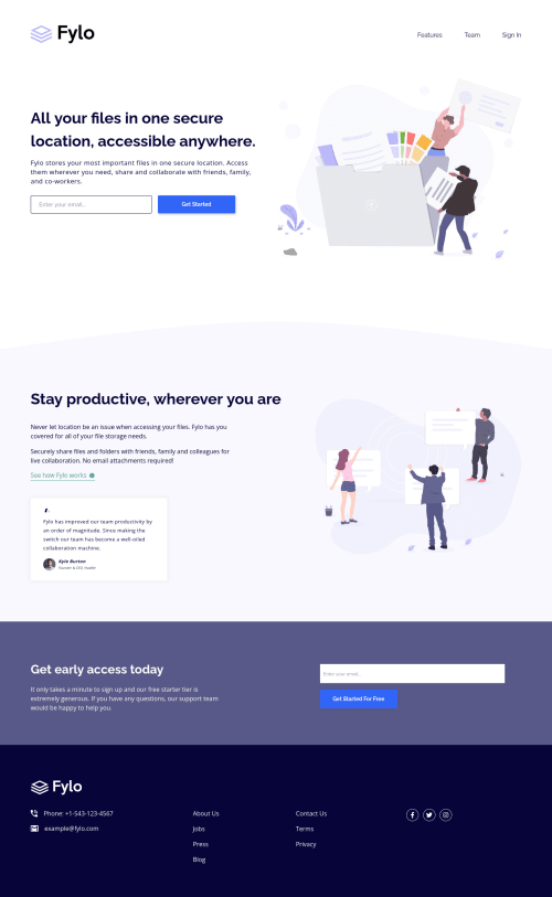
.element:focus-visible { outline: 2px dashed your color; outline-offset: 3px; }- I would make the hero-section-image hidden personally since it is just a vector. Also, again, avoid using words that relates to "graphic" such as "illustration" and others. An
imgis already an image/graphic so no need to describe it as one. - For a
formthat submits, usemethod="post". - Also for the
inputjust to post this again:
if ( input is wrong )
  input.setAttribute("aria-invalid", "true");
  input.setAttribute("aria-describedBy", id of the error-message);
else
  input.removeAttribute("aria-invalid");
  input.removeAttribute("aria-describedBy");
The error-message element should have an
idattribute which is referenced by thearia-describedByattribute on theinputelement. By doing that, your user will know that theinputis wrong because ofaria-invalidand they will know what kind of error they made because of thearia-describedBy- Another idea to implement to further improve accessibility is to have an
aria-liveelement that will announce if theformsubmission is a success or not. Posting this again for reference for accessible form - For the testimonial, I found out yesterday's discussion on the fem slack, you could use this markup:
<figure> <figcaption> image in here person name in here person position in here </figcaption> <blockqoute> quote in here </blockqoute> </figure>- Person's image should be visible since it is all about the person so add a
altwith their name as the value. - Adding
cursor: pointerto thebuttonon desktop layout would be great. - Also to be honest, I would put
aria-label="submit email form"for thebuttonbecauseget startedis not really clear right.
FOOTER
- Same for the header-logo-website-link use it on the footer as well.
- When you use
aria-hidden="true"on animg, make sure to usealt=""as well since you are hiding it right. - Use only 1
ulon those navlinks sine those are related links. - Lose the word
linkon the social-mediaatags sinceatag is already a link.
Aside from those, site looks really great again.
Marked as helpful

Join our Discord community
Join thousands of Frontend Mentor community members taking the challenges, sharing resources, helping each other, and chatting about all things front-end!
Join our Discord