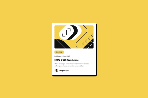
Submitted 5 months agoA solution to the Blog preview card challenge
HTML,CSS and google fonts

@samadeola1
Solution retrospective
What are you most proud of, and what would you do differently next time?
i think i did a good job, but there is always room for improvements.
What challenges did you encounter, and how did you overcome them?I had some challenges on the width and heights
What specific areas of your project would you like help with?The height and width if there are changes that it requires
Code
Please log in to post a comment
Log in with GitHubCommunity feedback
- @micheldrv
Looks really good and well done.
My advice is that for this challenge, I believe a max-width on the main container would suffice, no need to set the width as a percentage of the screen except maybe for very small screens. This would prevent the card from becoming too wide on some screen sizes (around 600px), and make it more consistent.
Marked as helpful

Join our Discord community
Join thousands of Frontend Mentor community members taking the challenges, sharing resources, helping each other, and chatting about all things front-end!
Join our Discord