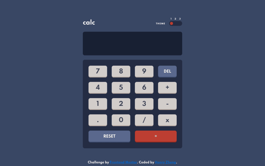
This looks very good, the styling is nice, and the calculation functionality works well.
It only really works with the mouse though, so there's a few things that could be done to improve the usability.
First of all, the button order in the DOM, and the button order on screen are very different. This makes the tab-order of the buttons seem very strange. The DOM order and visual order should match.
For an even better experience, we shouldn't need to tab through the buttons and press them manually. You could think about attaching an event handler to detect key presses on the document, so that the user can just type numbers and operators on their keyboard and have the calculator just work.
Marked as helpful
@LonelyBuddy
Posted
@AlexKMarshall
Thanks for the feedback, Alex! I just reordered all the buttons to match the DOM. Also, I added event handlers on Window to detect key presses. it took me a while to figure it out, but I learned a lot. Thanks again.😁

