
Solution retrospective
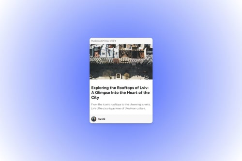
I’m most proud of how the project turned out visually. The gradient background, the card design, and the hover effects came together beautifully, creating a modern and clean look. I also enjoyed experimenting with typography and layout to make the design more engaging.
Next time, I would focus on optimizing the code further, such as using more semantic HTML and improving the accessibility of the project. Additionally, I’d experiment with CSS Grid to enhance responsiveness without relying on media queries.
What challenges did you encounter, and how did you overcome them?One of the main challenges was ensuring the project looked good across different screen sizes without using media queries. To overcome this, I used relative units like rem and em for font sizes and adjusted paddings and margins dynamically. Another issue was debugging CSS selectors, especially with hover effects. I solved this by carefully checking syntax and testing changes step by step in the browser’s developer tools.
What specific areas of your project would you like help with?I’d like feedback on: 1. Responsiveness: Is the design adaptive enough without media queries? Are there any improvements you’d suggest? 2. Typography: Do the font choices and sizes complement the overall design, or could they be improved? 3. Code optimization: Are there any parts of the CSS that could be refactored for better readability and maintainability?
Please log in to post a comment
Log in with GitHubCommunity feedback
- @ThariqRamadhan101
the solution different with the design

Join our Discord community
Join thousands of Frontend Mentor community members taking the challenges, sharing resources, helping each other, and chatting about all things front-end!
Join our Discord