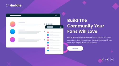
Huddle Landing Page | Responsive HTML & CSS Flexbox Solution

Solution retrospective
I’m most proud of creating a fully responsive landing page that closely matches the original design on both desktop and mobile screens. I also improved my understanding of Flexbox, spacing, and responsive layouts using media queries. Next time, I would focus more on writing cleaner and more scalable CSS by organizing styles more efficiently and improving accessibility.
What challenges did you encounter, and how did you overcome them?One of the biggest challenges was making the layout responsive across different screen sizes while keeping the design consistent with the provided mockups. I also had difficulty aligning the hero section and adjusting spacing for mobile devices. I overcame these challenges by using Flexbox, experimenting with media queries, and refining the layout step by step through testing.
What specific areas of your project would you like help with?I would like feedback on improving my CSS structure and responsiveness. I also want to learn better ways to organize styles for larger projects and improve accessibility practices. Suggestions for writing cleaner media queries and creating more reusable CSS components would also be very helpful.
Please log in to post a comment
Log in with GitHubCommunity feedback
No feedback yet. Be the first to give feedback on Sasi-2006’s solution.
Join our Discord community
Join thousands of Frontend Mentor community members taking the challenges, sharing resources, helping each other, and chatting about all things front-end!
Join our Discord