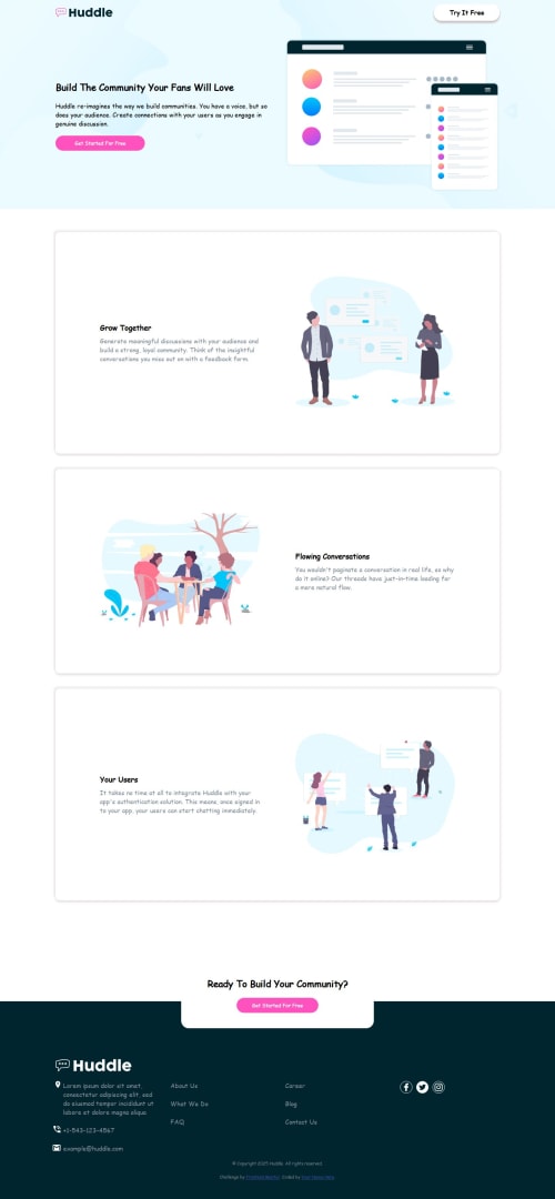
Submitted 5 months agoA solution to the Huddle landing page with alternating feature blocks challenge
Huddle landing page with alternating feature blocks
accessibility
@Ehiejakhian

Solution retrospective
What are you most proud of, and what would you do differently next time?
I'm proud of the responsiveness of the page, its awesome and cool. My best yet. Next time, I'll love to use less CSS.
What challenges did you encounter, and how did you overcome them?Padding. I had to make all the left and right padding of the content same while keeping the margins at 0. Using percentages worked for me.
What specific areas of your project would you like help with?I don't see any, but I'll always welcome criticism and suggestions. Thanks people!
Code
Loading...
Please log in to post a comment
Log in with GitHubCommunity feedback
No feedback yet. Be the first to give feedback on Ehi's solution.
Join our Discord community
Join thousands of Frontend Mentor community members taking the challenges, sharing resources, helping each other, and chatting about all things front-end!
Join our Discord