


P
Christopher Adolphe• 580
@christopher-adolphe
Posted
Hi @TheCoderGuru 👋,
You did a great job in completing this challenge. 👍 Everything is nice and clean. 👌 I have noticed a few thing that you might want to check.
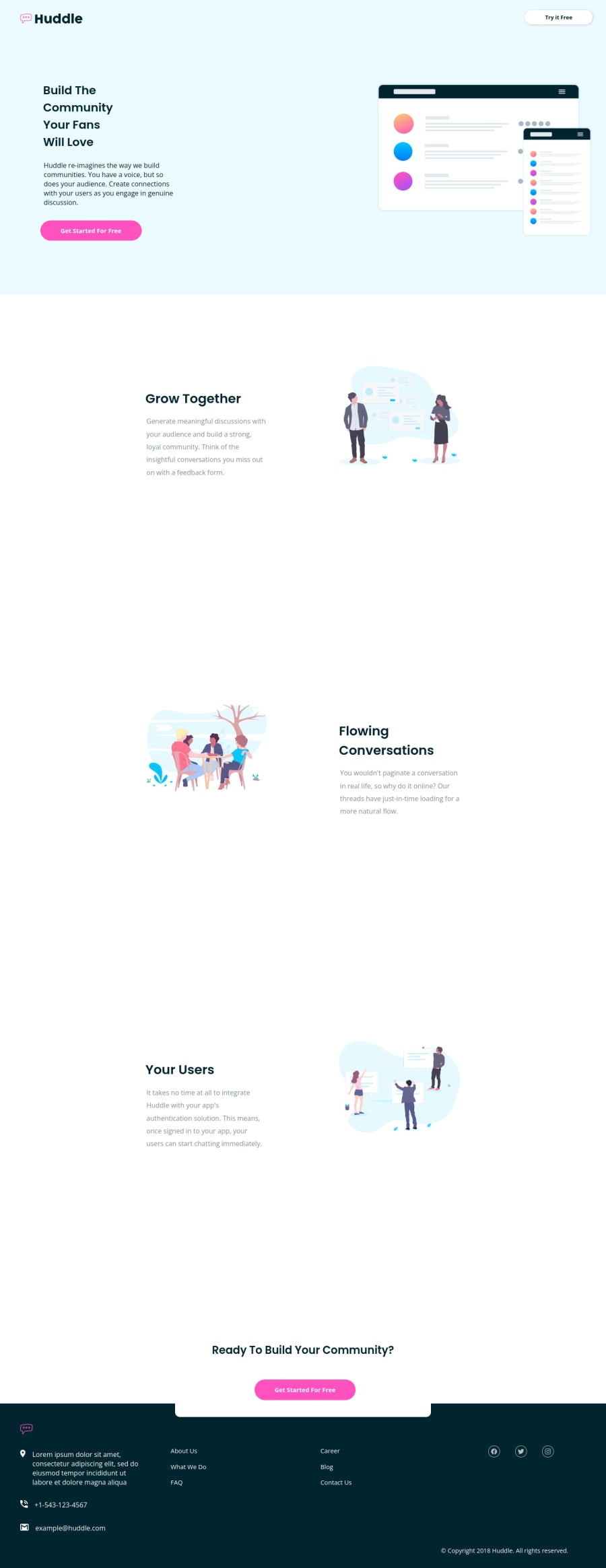
- On large viewports, the overall content of the page is stretching horizontally thus creating a huge gap between the 2 column content. Adding a wrapping
<div>element with amax-widthinside each section should correct that. 😉 - When the viewport is around 1024px and up to 1200px, the content of the 1st column of the hero section is squeezed.
gap: 15rem;is too much on this viewport range. - The shadow around the feature cards in the main content is missing. Moreover, the text content and the image should alternate positions. You could achieve this by applying the following styles:
.grid-container:nth-child(even) {
  .grid__content {
    order: 2;

   + div {
     order: 1;
   }
  }
}
However, for this to work properly, the absolute positioning should be removed on the <img />. By looking at the design, I don't think position: absolute; is even required here.
- I would have suggested you to write the markup for these feature cards in mobile-first approach; meaning the image content would be the 1st child element of the card and then the text content, something like this:
<div class="grid-container">
  <div class="grid__image">
    ...
  </div>

  <div class="grid__content">
    ...
  </div>
</div>
Since this is the default order of the content, you wouldn't have much style to add on mobile and as the viewport widens, you could then apply the suggested above style to create the alternating content position like this:
@media (min-width: 1024px) {
  .grid-container:nth-child(even) {
    .grid__image {
      order: 2;
    }

    .grid__content {
      order: 1;
    }
  }
}
- In the footer, I think
About Us,What We Doetc. as well as the social media icons should be links.
I hope this helps.
Keep it up.
0


