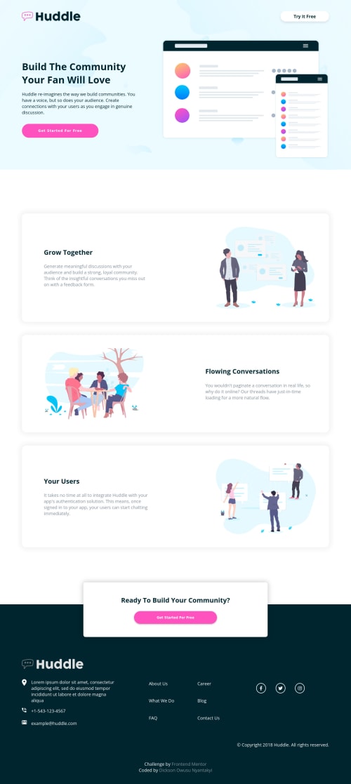
Huddle landing page with alternating feature blocks

Solution retrospective
PLEASE NEED HELP!!!
i use my desktop screen and IPhone 12 pro max screen as my coding reference but when I'm done and checking how it looks on other screens. Everything falls apart. The text and images are at the right places its just not the same as the design in the project file anymore. Unless i turn the screen back to the aforementioned screens.
Please help, any solution to fix this?
Please log in to post a comment
Log in with GitHubCommunity feedback
- @esthernickani
Use chrome dev tools to mock how other screens look like and use media query’s to write measurements for those screen sizes. Basically make it responsive. Since you used ‘‘em’, you might not need to change all the specifications.
Marked as helpful - @ondickson
Thanks for the feedback. I will try using chrome again, see how the next project would look like.

Join our Discord community
Join thousands of Frontend Mentor community members taking the challenges, sharing resources, helping each other, and chatting about all things front-end!
Join our Discord