Not Found
Not Found
Not Found
Not Found
Not Found
Not Found
Not Found
Not Found
Not Found
Not Found
Not Found
Not Found
Not Found
Not Found
Not Found
Not Found
Not Found
Not Found
Not Found
Not Found

Submitted

Huddle landing page with curved sections-Flexbox

hammercait 250

@hammercait

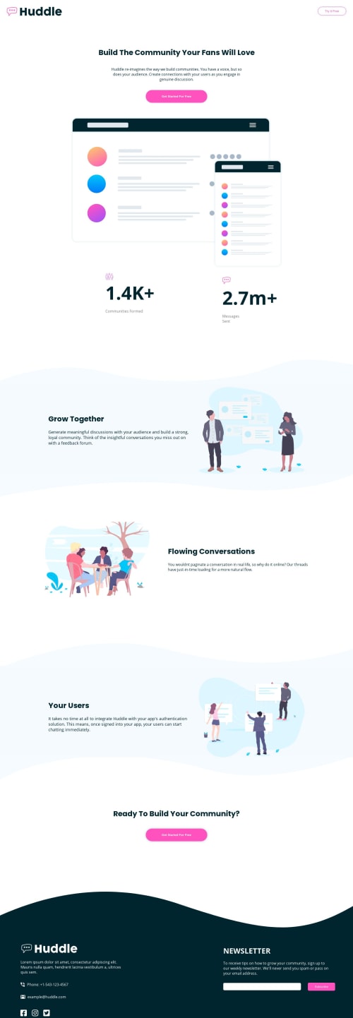
Desktop design screenshot for the Huddle landing page with curved sections coding challenge

This is a solution for...

  • HTML
  • CSS
2junior
View challenge

Design comparison


SolutionDesign

Solution retrospective


Feedback more than welcome as well!

EDIT 9/17 redid code from the top and now more mobile responsive!

Community feedback

@sankaragomathym

Posted

Hey!! Nice work.. Adding 'box-sizing: border-box' to all elements will solve half of your problem. The padding will affect the width of the element when you resize. Next, instead of changing flex-direction to column, you can go for 'flex-wrap: wrap'. And try to avoid unnecessary margins. These are increasing the space between 2 elements in mobile view. Hope this helps.. :)

1

hammercait 250

@hammercait

Posted

@sankaragomathym thank you so much for taking the time to help!! I will take your advice and go redo some of the code. Thank you thank you!

0

Please log in to post a comment

Log in with GitHub
Discord logo

Join our Discord community

Join thousands of Frontend Mentor community members taking the challenges, sharing resources, helping each other, and chatting about all things front-end!

Join our Discord