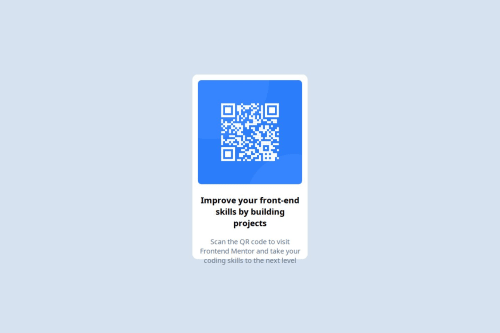
I have used custom CSS and CSS flex-box for this project.

Please log in to post a comment
Log in with GitHubCommunity feedback
- @MandalTuhin
Your solution is great. Here is what I think about it: What's great:
- The colors, look accurate and consistent.
- The Card is centered both horizontally and vertically as asked in the problem.
- Fonts look consistent.
Potential Improvements you can think of:
- The text is overflowing out of the card, It can be fixed by reducing font-size of the heading as well as the paragraph below it.
Join our Discord community
Join thousands of Frontend Mentor community members taking the challenges, sharing resources, helping each other, and chatting about all things front-end!
Join our Discord