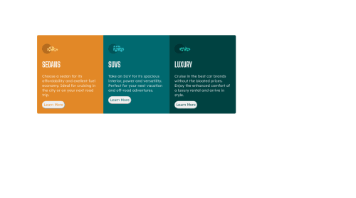
I use flexbox and media queries to do responsive designs

Solution retrospective
HI every comment is welcome .
Please log in to post a comment
Log in with GitHubCommunity feedback
- @madegilangaditya
Hi Moh, congratulations for finished the challenge. Here are some suggestions for you:
- Use
justify-content: center;in your flexbox to make your column align center. - add some padding in your button.
- add margin top in your button so there is space between text and button
- Use
Join our Discord community
Join thousands of Frontend Mentor community members taking the challenges, sharing resources, helping each other, and chatting about all things front-end!
Join our Discord