I used flex and grid

Solution retrospective
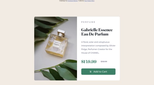
Please be as critical as possible, all criticism is good criticism. Still new to this I had trouble trying to learn it up (this is my first frontend mentor challenge), had to hard code widths because it wasn't working properly, I need to work on the amount of code I have written down, I tried to follow the DRY rule I think. I tried to stay on top of semantic HTML, it was difficult trying to center the container so its a bit of funky code, flex => justify and align center wasn't working for me only align was, and I tried to keep it accessible but wasn't sure what else to add. Im familiar with js but I wanted to keep it just HTML and CSS so I've set the images to display none depending on screen size, and as I'm typing this i see i put too much padding/margin on the pricing for mobile but oh well. I appreciate the feedback from anyone.
Please log in to post a comment
Log in with GitHubCommunity feedback
- @jish0101
It looks good, do margin bottom properly and put that title after the box, check mine.
Marked as helpful

Join our Discord community
Join thousands of Frontend Mentor community members taking the challenges, sharing resources, helping each other, and chatting about all things front-end!
Join our Discord