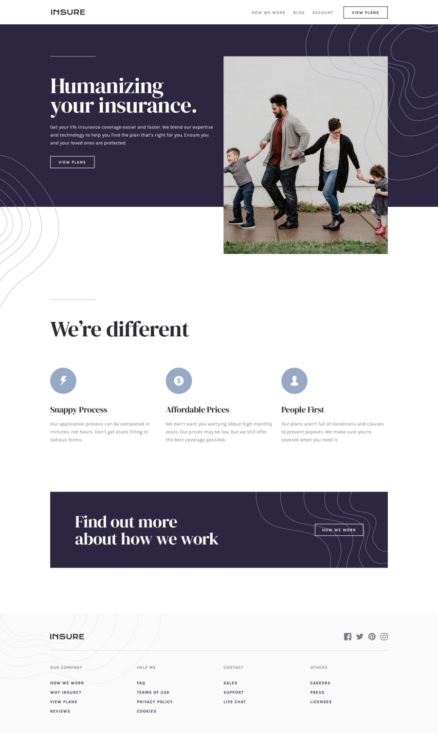
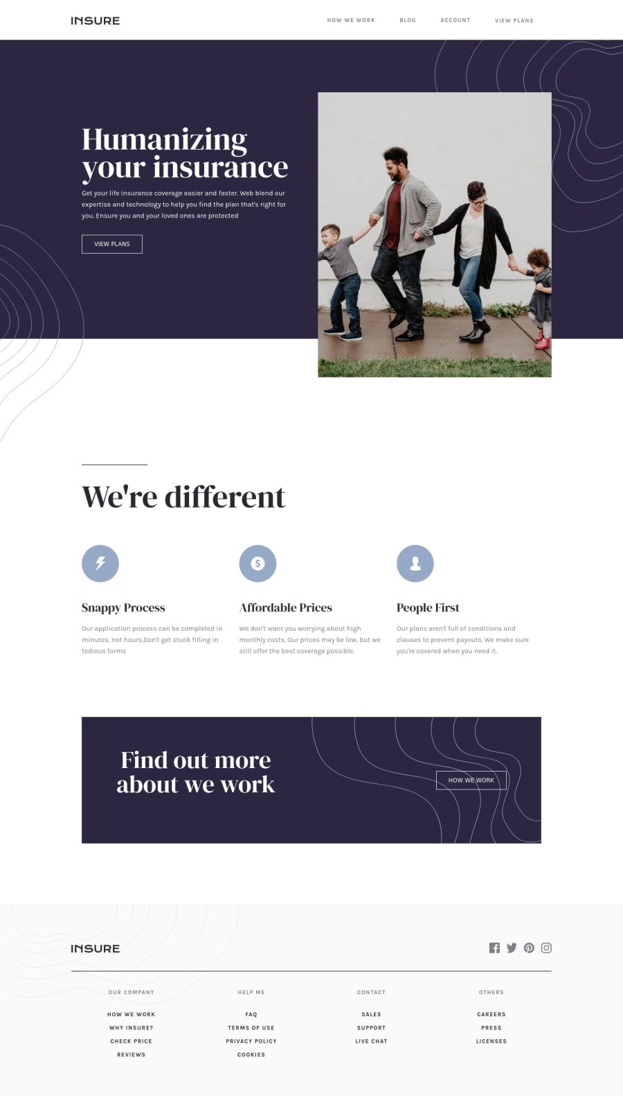
Hey @AlecANL really lovely job on this one! The site looks great and responds well at all viewports I checked. 🙌
Here's some very general suggestions that you might like to consider:
- One thing to think about is focus styles and keyboard navigation. At the minute you are using the default outlines, which is fine, but adding some custom styles would look great.
I have found the advice in this article very useful, and use it in pretty much all my projects: https://css-tricks.com/the-focus-visible-trick. This can also help you find other tricky bits, see point two below.
- For the burger menu, I would suggest that you use a
buttonto open the menu rather than adiv. This has a lot of the functionality that would be ideal here built in (e.g. focusable with keyboard, nice for assistive tech users etc.).
I use this tutorial as a basis for the burger menus that I create. It's heavy going but very thorough. https://piccalil.li/tutorial/build-a-fully-responsive-progressively-enhanced-burger-menu/
Some other smaller points to think about that are specific to this challenge:
- I would put the social icons inside a link tag - and possibly consider using the svgs inline in the html as it has slightly better performance. (I would also wrap them in a
ulrather than a div) - For the grid area, on tablet sized screens the third item is sometimes alone on a new row, and because it's grid it sits in one column only. I would either fix this with either a media query or use flex, with flex-wrap and some min-width on the children.
Hope this helps, and once again - really nice work on this one!! 👍
Cheers 👋
Dave

