


Dellcash• 340
@Dellcash
Posted
Thanks a lot for helping!!
0
Looking to hire developers?
TailwindCss and PetiteVue
@Dellcash
Posted
Thanks a lot for helping!!
@Nam-Hai
Posted
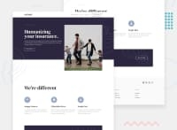
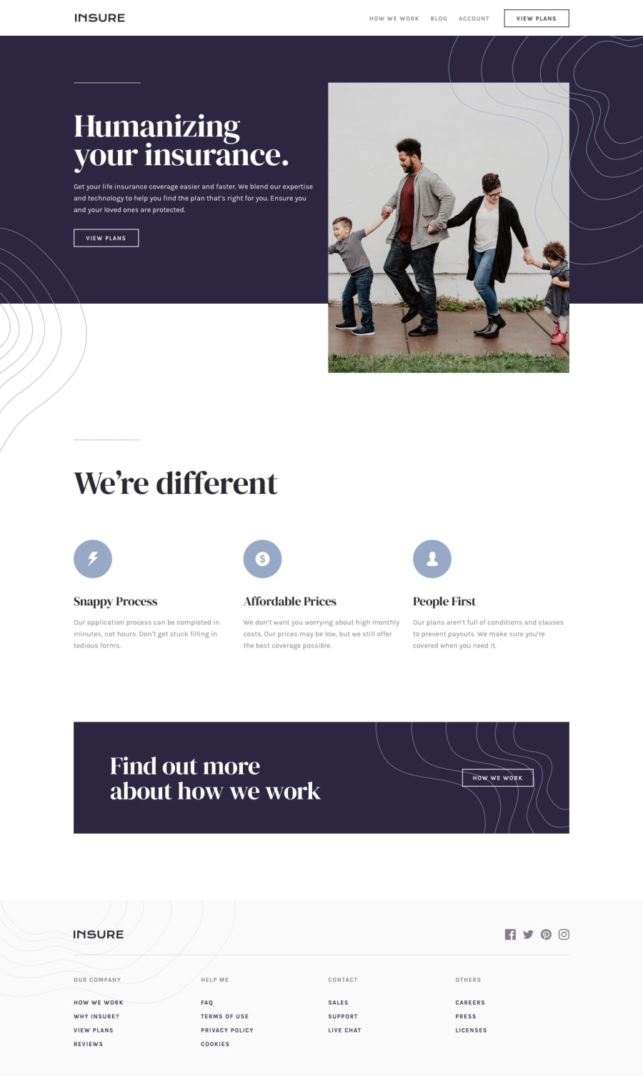
Great work, the visual is great and very close to the original design.
First of all, try to use <h1> only once in a webpage. html is a descriptive language, thus h1 describe the most important header in your page. Here it could have be "Humanizing you insurance". Use <h2> for headers with less importance, and <h3> with headers with even less importance. For the nav bar; Don't you header! use <a href="#"></a> or at least a <button>. Here there a no link, but in a functionnal, there would have been. Headers are for headers.
Try to put alt values to images, this is for accessibility purpose, if the image doesn't load we can at least understand what should be there.
On the button "how we work" The background image (which you implemented by directly puting a <img> which is totaly fine) is in front of the button; You used z-index: -1 to try putting back behind the button but it didn't work. You need to set to the "how we work" button z-index and position value also.
Join thousands of Frontend Mentor community members taking the challenges, sharing resources, helping each other, and chatting about all things front-end!
Join our Discord
