Submitted over 5 years agoA solution to the Insure landing page challenge
Insure Landing Page | HTML and CSS only

@SGolbert
Solution retrospective
I made the mobile upper bar sticky and added a transition for it. I would love to read your feedback!
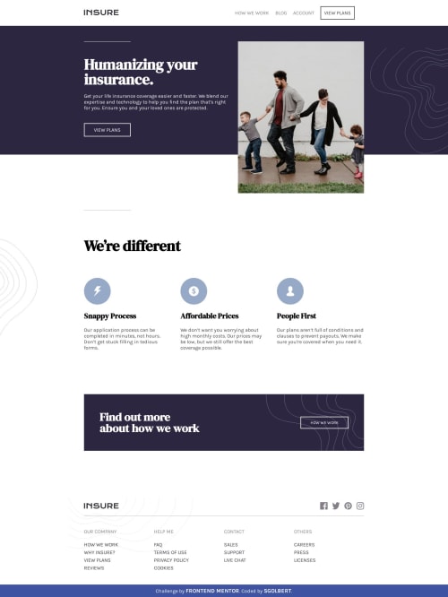
Additionally, I left the text on the "We're different" part uncentered. I don't like centered paragraphs in general, let me know which variant do you prefer!
Code
Please log in to post a comment
Log in with GitHubCommunity feedback
- @SGolbert
Thanks Gerben! I'll let you know when I upload an improved solution :D
- @GerbenDol
I love the animation you made for the mobile navigation, really clever!
Small improvements I think would improve the result would be:
- On desktop make the website fill the browser's full width
- Add a white background to the main content area to make it stand out a bit more - like in the design!
All in all great solution!

Join our Discord community
Join thousands of Frontend Mentor community members taking the challenges, sharing resources, helping each other, and chatting about all things front-end!
Join our Discord