


@ApplePieGiraffe
Posted
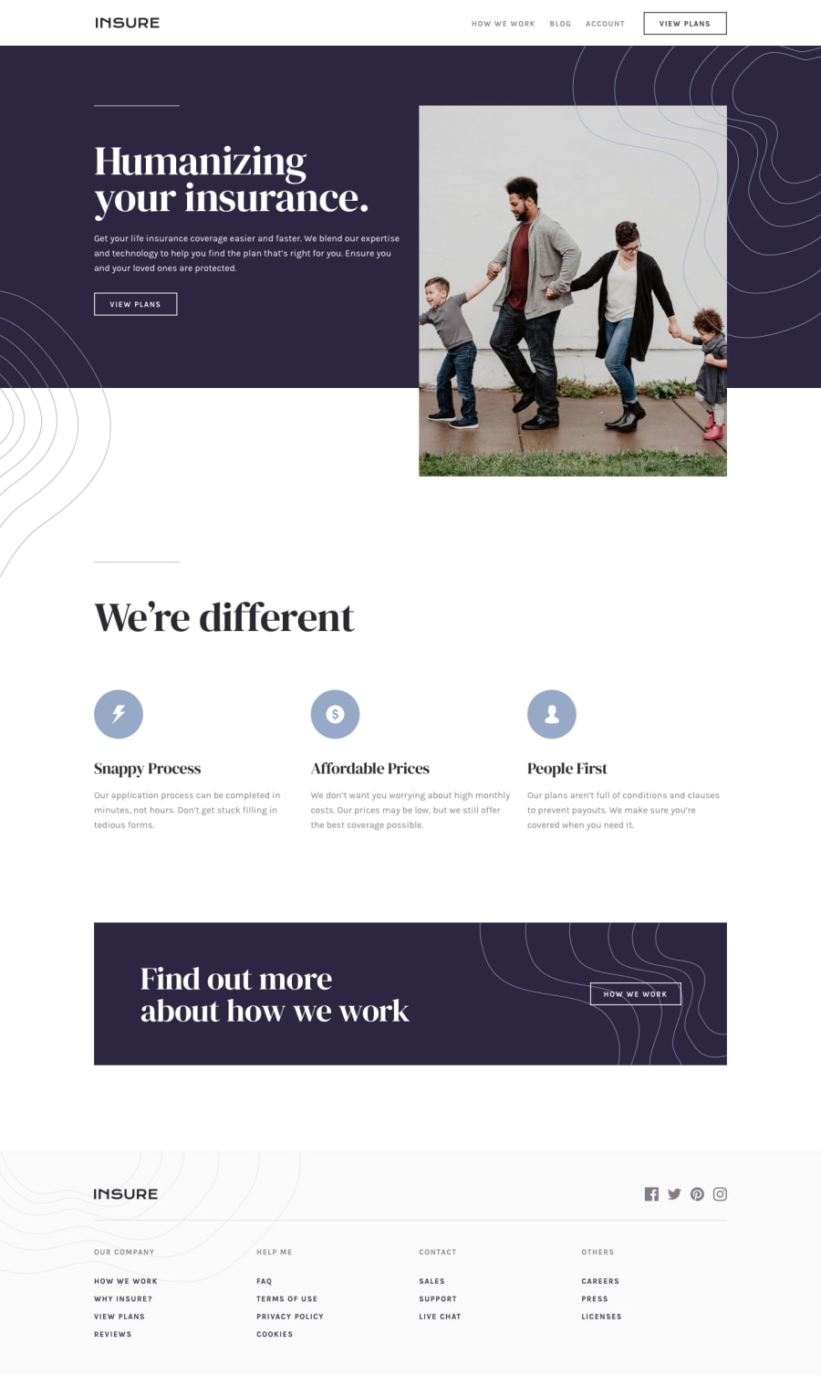
Hey, isimeri! 👋
Nice work on this challenge! Your solution looks good! 👍
I suggest,
- Adding a
max-widthto the main container or wrapper to prevent the design from looking too stretched on extra-large screens. - Allowing the design to fill up the entire area of the screen when the page is resized (so that there isn't any blank space to the sides of the content when the width of the screen decreases).
- Don't forget to add an
altattribute to your images and to identify each<section>tag that you use with a heading to clear up your solution report and make your solution more accessible.
Keep coding (and happy coding, too)! 😁
@isimeri
Posted
@ApplePieGiraffe Thank you for the suggestions. Totally didn't think about super big screens, gotta fix that. I don't like the extra blank space either, but the background image(family photo) looks kind of blurred already. It'd look quite ugly if i let it take up even more space, i already tried. Do <section>s really need headings? There is a <section> in my code that i used just for two background images and could totally do without a heading. I guess i'll just replace it with a <div>.
@ApplePieGiraffe
Posted
@isimeri
You could transition to a mobile-friendly layout but not change to the mobile-friendly background image until the screen width gets even smaller. That way, the image will still look clear and only change when the width of the screen gets small enough for the resolution to not be noticed.
Also, yeah, it's recommended to only use a <section> tag if you have a heading to go along with it. But I think a <div> will do fine, then, as you said! 😉

