Not Found
Not Found
Not Found
Not Found
Not Found
Not Found
Not Found
Not Found
Not Found
Not Found
Not Found
Not Found
Not Found
Not Found
Not Found
Not Found
Not Found
Not Found
Not Found
Not Found

Submitted

Insure landing page with CSS Grid and Flexbox

P
Kalvin Hartβ€’ 140

@kalvinhart

Desktop design screenshot for the Insure landing page coding challenge

This is a solution for...

  • HTML
  • CSS
  • JS
2junior
View challenge

Design comparison


SolutionDesign

Solution retrospective


This was my first attempt at developing something mobile first. It was also my first attempt at making a landing page.

There are several issues that I have come accross and would appreciate any help/advice:

  1. Upon hosting the page with github pages, I seem to have lost 2 images - the patterns for the intro section that were in the ::before and ::after. They show up fine on my local machine during development, why are they not loading on the github page?

  2. With screen widths < 375px the main image scales down which then leaves the ::before pattern image lingering and looking out of place, I am not sure how to fix this. It might be hard to see what I mean seeing as the image no longer displays as per point 1 above.

  3. Again with the intro pattern images, this time the ::after image on large screens. It shows above all other elements despite my header element having a z-index of 100 and position: fixed. I am not sure why this is happening?

Any other tips/advice would be appreciated as I'm sure I probably haven't used the mobile first approach in the most efficient way?

Many thanks!

Community feedback

P
ApplePieGiraffeβ€’ 30,545

@ApplePieGiraffe

Posted

Hello, Kalvin Hart! πŸ‘‹

Nice to see you complete another challenge! πŸ˜€ Good work on this one! πŸ‘

As for your first point, it looks like you're compiling your Sass to a CSS file that isn't located in the same folder as those Sass files. That means that the relative file paths you specified in your Sass files won't make sense in the compiled CSS file. From what I can tell, only moving one folder above the current folder (rather than two) in order to access the images folder might do the trick.

I suggest,

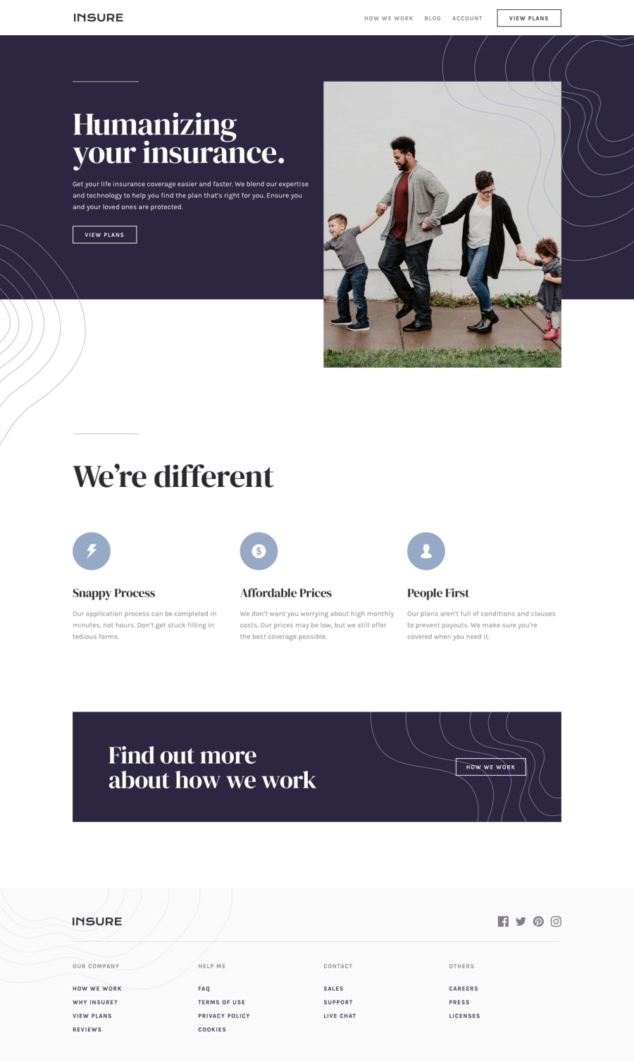
  • Decreasing the space between the navigation links in the header of the page in the desktop layout when the screen width decreases.
  • Adding overflow-x: hidden to the body to prevent a horizontal scroll bar from appearing along the bottom of the page in the desktop layout.

Keep coding (and happy coding, too)! 😁

1
Mijail Hernandezβ€’ 950

@MishaHernandez

Posted

Hello, Kalvin Hart!

  • The header element is shown below the pattern because its z-index does not work for positioning with static values (position: static), so I recommend changing it to position: relative.

Greetings and I hope my feedback has been useful to you :)

0

Please log in to post a comment

Log in with GitHub
Discord logo

Join our Discord community

Join thousands of Frontend Mentor community members taking the challenges, sharing resources, helping each other, and chatting about all things front-end!

Join our Discord