Insure Responsive Landing Page using CSS Flexbox

Solution retrospective
Got some problems with z-index property. For some reason I can't make the mobile pattern sink under the heading and the button of the intro section (hero). You can see this by sizing the window to approximately 400px wide. Any advice? Thank you in advance.
Please log in to post a comment
Log in with GitHubCommunity feedback
- @pikapikamart
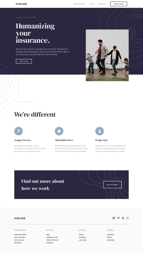
Hey, great work on this one. Desktop layout looks great, just needed the hero-section image to be taller like on the design, the site is responsive and the mobile state looks really great.
Ben already gave a feedback on this one, just going to add some suggestions as well:
- The
headershould only be containing the topmost part of the layout, the website-logo, the navlinks. The hero-section downwards should be placed inside themain. - Since you are treating the website-logo as interactive ( putting cursor: pointer)m, it would be great to use
atag on it and treat as a real link. Website-logo-linkatag should have eitheraria-labelattribute orsr-onlytext inside, that describes where the link would take the user. Usually, website-logo directs user to homepage so usehomepageas the value like `aria-label="homepage". - Remember that a website-logo is one of the meaningful images on a site so use proper
altfor it. Use the website's name as the value likealt="Insure". - Also, wrap the whole content of the
.nav-rowinside anavor just simply change the.nav-rowfrom usingdivto usingnavsince those will be your navigational links. - If you somehow use tab key on your keyboard to navigate and navigated on the
view plansit is hard to tell where you are at right. It would be great to instead use the defaultoutlineof the:focusstate of an element use a customoutline. For example:
input:focus-visible {
  outline: 2px dashed red;
  outline-offset: 3px
}
This way, your site have its own customized
outlineas a visual indicator.- The hero-section image could have used a descriptive
altvalue since it is meaningful if you look at it as it is descriptive in content. - Those background-patterns could have been used as value in the
backgroundproperty on an element. This way, you won't have to create extra html tags for each of them. view plansis more better to useatag rather thanbuttonsince it looks more of a link rather than a control for opening up like a modal.- Only have a single
h1on a site. It would be great to change those headings into something likeh2. - Those 3 icons on the
We’re differentare not links, they are just simple animgtag which is hidden since those are decorative images and since you are usingsvgon them, usearia-hidden="true"attribute on thesvgto hide them.
FOOTER
- Same with the company logo, use a more proper
altvalue. - Each
atag that wraps the social-media icon should have eitheraria-labelattribute orsr-onlytext inside it, defining where the link would take them. For example, you should usefacebookas the value if the link would take the user to facebook. - Social-media image should be hidden since it is only a decorative image so use
aria-hidden="true". - For those 4 sets of links at the bottom, you could wrapped them in a single
navsince those are still your website's navigational links and add anaria-label="footer"on thenavso that it will be unique. - Since those 4 sets are links, use
atag for each of those. Again, interactive components needs to use interactive elements. - A markup that you could use for those 4 sets could be this one:
<nav aria-label="footer">
  <ul>
    <li>Our Company
      <ul>
        <li> <a href="">{link in here}</a></li>
        ....
        ...
      </ul>
    </li>
    <li>Help Me</li>
    <li>Contact</li>
    <li>Others</li>
  </ul>
</nav>
And so on, just use the first sample of the Our Company for the other list-heading.
MOBILE
- The hamburger
buttonshould have a default attribute ofaria-expanded="false"and it will be set totruewhen the users toggles it and vice-versa. - The hamburger
buttonshould have eitheraria-labelattribute orsr-onlytext inside it which defines what thebuttondoes. You could usearia-label="navigation dropdown menu" - The
imginside the hamburger-menu should have been hidden since it is only a decorative image so addaria-hidden="true"on it. - Also, you don't need to create 2
buttonfor each toggle. You could have just changed thebackgroundof eachbuttonbased on their state. Showing the hamburger if it is not toggled and showing the X if it has been toggled.
Aside from those, great job again on this one.
Marked as helpful - The
- @BenConfig
Hey, I tried this and it fixed the issue:
.hero-content { isolation: isolate; z-index: 1; }Marked as helpful


Join our Discord community
Join thousands of Frontend Mentor community members taking the challenges, sharing resources, helping each other, and chatting about all things front-end!
Join our Discord