Interactive component with appearance:none for input

Solution retrospective
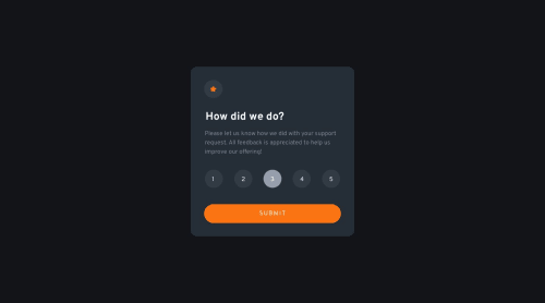
In this challenge, I removed input style with appearance: none, using just label for rating instead since you can click respective label to select that radio button.
My question is: How to eliminate the difference(a blue dot for checked radio button) of appearance: none between Chrome and Firefox? Here's the screenshots about this issue Chrome Firefox
What's your solution to this challenge? Do you style the input without completely removing the default styles? Any advice/comments are welcomed🙏
(updated: the blue dot issue would be solved by setting input outline: none, thanks to @SutonToch)
Please log in to post a comment
Log in with GitHubCommunity feedback
- @SutonToch
Congrats on completing the challenge!
To remove the blue dot in Firefox, try
outline: none;on the inputs.appearance: none;doesn't seem to coveroutline, but I didn't know that too until now.There are many different ways to accomplish the rating, and choosing the radio input is definitely a good one, because you need less JS. I chose simple div's at the time, but radio inputs are better.
I don't know how you would get the numbers into the radio input, except with awkward positioning which I'd always avoid if possible, without removing the default styles on the input. Therefore, I think using the label is the best option. But I'm also interested in other opinions :)
Be proud of yourself for submitting the challenge to the public! You did a great job! Keep on going :)
Marked as helpful

Join our Discord community
Join thousands of Frontend Mentor community members taking the challenges, sharing resources, helping each other, and chatting about all things front-end!
Join our Discord