Interactive Pricing Component. Made with HTML-SCSS-JAVASCRIPT + MFA

Solution retrospective
Hi! Everyone, I made this project using Vanilla JS with SCSS. I learnt a lot from this challenge and it was really a good experience for me, I learnt some cool things about how to make custom input component. I added the prefixes in the CSS in order to make design consistent through all browsers. I also made it responsive, but let this decide by you (current viewer LOL ). So please go through the design, code and leave your precious feedback below, So that I can improve myself more. I would love to hear feedback regarding the design, code and structure. Any feedback to make it more accessible to screen-reader will more highly appreciated.
Please log in to post a comment
Log in with GitHubCommunity feedback
- @grace-snow
Hi
How do you expect screenreader users to understand which price is active on this? A checkbox implies an on/off state. It’s ideal for yes/no answers or on/off toggles. It’s not really ideal for a switch like this that has has two distinct and labelled states - how would I know whether checked means monthly or annual? It’s very unclear. In these cases it is always better to use radio inputs.
The other issues I see with this are
- again screenreader content order and content change announcement. I think some aria-live attributes are needed, or even a screenreader specific message
- header always goes outside of main, not within it. It is it’s own landmark
- similar this should not have an article within it, or sections. It’s all one related piece of content
- if using a button to submit the chosen options this should all be a form.
Marked as helpful - @anoshaahmed
This looks good Aakash great job. One thing I can recommend is adding a space between
"Sign-up for our 30-day trial."and"No credit card required."lolMarked as helpful - @remusbuhaianu
Hey @skyv26 , always nice seeing more of your projects here on Frontend Mentor!
I appreciate how you always try to make your solution as pixel-perfect as possible! ;)
Here are my suggestions / observations based on your design:
-
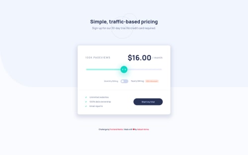
There shouldn't be a 0 value on the slider as far as I know. The first value on the slider should be 10k page views at 8$ (I might be wrong about this, please do double check to make sure)
-
On laptop resolution, the background image doesn't fully stretch horizontally from one end to another of the body's width
-
Try to reduce the card's box shadow a bit - reduce the shadow opacity and maybe also tweak the blur amount too
-
The folder structure was a bit confusing because you have a sass folder and a css folder but the main sass file is actually inside the CSS folder
I have to ask you something: Did you actually write over 1000 lines of raw SCSS code?? That's incredible!
As developers, we all should strive to write clean, efficient, maintainable, and reusable code with the least amount of lines of code that's realistically possible. An educated guess from me would be that the design for this project can be completed in less than 500 lines of SCSS code.
I like the way you write and structure your code. You're quite a competent developer, no doubt. But you shouldn't do two things at once while working on such projects: coding and writing novels because that's how long your lines of code can get to the point that it feels like reading a page from a novel :))
I'm looking forward to seeing more of your solutions here on Frontend Mentor. Keep up the amazing work!
Marked as helpful -


Join our Discord community
Join thousands of Frontend Mentor community members taking the challenges, sharing resources, helping each other, and chatting about all things front-end!
Join our Discord