


@pikapikamart
Posted
Hey, upon loading this, the layout is somewhat odd, shifting to mobile layout there are couple of issues but reaching it, it is good.
Suggestions would be that:
-
Removing that
height: 100%on thebodytag will really help keep the layout good. Setting that to 100%, it takes 100% of the remaining height on the viewport, since thebodytag have no parent (is html a parent?). That makes the content shifting positions. Removing that will be better and instead add amin-height: 100vhormin-height: 100%. -
Adding
cursor: pointeron the toggle, just to add some natural feeling since it is an interactive element. -
Adding
text-align: lefton theulelement on thefeaturesselector, just to make them properly aligned. -
Resizing the browser, your layout doesn't really scale with it. it will be better if you made the mobile layout transition a lot sooner to prevent the viewport overlapping the content. Also that 375px breakpoint is too small, phone nowadays have a higher ppi on that, adjusting to 400 - 410px range will be good. But still keep in mind of making it more sooner, to prevent the viewport.
-
Your mobile layout seems clamped, adjusting those spacings, to the top and bottom of the elements will be really good.
But still, good work on this one^
@alexvalpeter
Posted
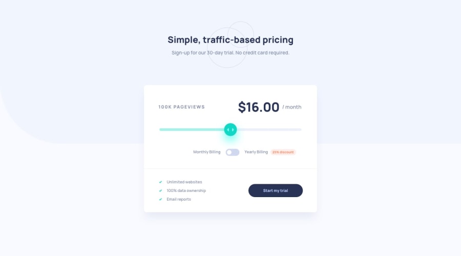
@pikamart Hi there! I appreciate you taking the time to review my code, but most of the things you listed are things that I have done on purpose. In these challenges I only focus on the desktop and mobile design, so I am aware that it does not scale. If this were a real job I would do this, but for these I code only for the mobile and desktop dimensions given by the style guide, which are 375px and 1440px respectively. I have also center-aligned the list and placed the cursor: pointer on the switch on purpose. html is parent to body and html is relative to the viewport, so 100% on both is the same as 100vh/vw. Thank you again, but I really would just like to know why the slider thumb looks different in Safari vs Chrome when they are both webkit browsers.
