Not Found
Not Found
Not Found
Not Found
Not Found
Not Found
Not Found
Not Found
Not Found
Not Found
Not Found
Not Found
Not Found
Not Found
Not Found
Not Found
Not Found
Not Found
Not Found
Not Found

Submitted

Interactive pricing component using HTML, CSS and JavaScript

Davide• 1,725

@Da-vi-de

Desktop design screenshot for the Interactive pricing component coding challenge

This is a solution for...

  • HTML
  • CSS
  • JS
2junior
View challenge

Design comparison


SolutionDesign

Solution retrospective


Hi everyone, this is my first project in HTML, CSS and vanilla JS, as a beginner i've srtuggled a lot, especially the design has been a hard challenge. I've tried my best but due to my lack of experience i don't know if CSS structure is ok, i've started from smaller width and then i've added 5 more media queries. Is that correct?

There are some issues i couldn't fix:

  1. I can't split the subtitle text in the header (mobile version) exactly as is shown in the picture.

  2. The line inside the card has space left and right, so it doesn't fit the whole card width.

  3. The arrows that move the slider are too big i don't know how can i adjust them.

  4. I can't resize the circles (header background image) for desktop screen width.

I've simulated the subscrition when the button is clicked but the body background image gets smaller when the page is empty (only desktop). Why?

You may find more mistakes, thank you in advance for taking the time and see my solution.

Community feedback

Agata Liberska• 4,015

@AgataLiberska

Posted

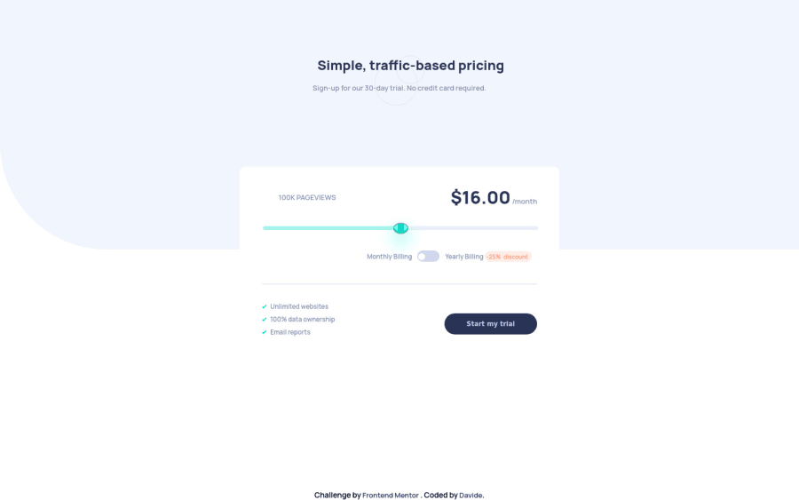
Hi Davide, well done on your first project! Quite an ambitious choice with the slider and it looks really good!

One note: you have most of your styles inside a media query for min screen width of 375px. This means that on screens narrower than that, all styling disappears. I would remove that query completely and just have those styles as a base for all screen sizes, and then add media queries to elements you want to modify on larger screens.

As for your 1st question, you've set padding-left and padding-bottom to the subtitle text (in the padding shorthand, it goes: top right bottom left). If you want it centered exactly as in the design, you could set padding on left and right and that would work on small screens. You could also set a max-width on that text and margin: auto to center it, but this would mean changing your media queries styling as well. I would also add text-align: center to the h1.

Hope this helps but again, really well done!

1

Davide• 1,725

@Da-vi-de

Posted

Hi Agata Liberska, thank you very much! :-) I made the changes you suggested and it looks better, I deleted the first media query as well. Thank you again for taking the time and look at my code, i really did appreciate your help. Happy coding, have a nice day.

0
Elizabeth• 460

@gelizabeth

Posted

Hi Davide, It's a great result for first project! I'll try to answer some of your questions: 2. It has spaces because you card element has paddings, to fix that try setting margins and paddings to its children elements instead of setting padding for card element. 4. Circles size depends on header height, because you set background-size:contain. Try playing around with the height.

After the subscription your body has only header element, so it's height and width are the same as header's. body{height:100vh, width:100vw} will fix this.

Hope this helps. Happy coding!

1

Davide• 1,725

@Da-vi-de

Posted

Hi Gelizabeth, thank you very much, yes it did help, in 2 minutes i fixed 2 major problems. About the line i got it but i'd better leave it like this, i should touch many things... I've learned the lesson, the next time i will be more careful when it comes to deal with white spaces. I appreciated your help, happy coding to you too.

0

Please log in to post a comment

Log in with GitHub
Discord logo

Join our Discord community

Join thousands of Frontend Mentor community members taking the challenges, sharing resources, helping each other, and chatting about all things front-end!

Join our Discord