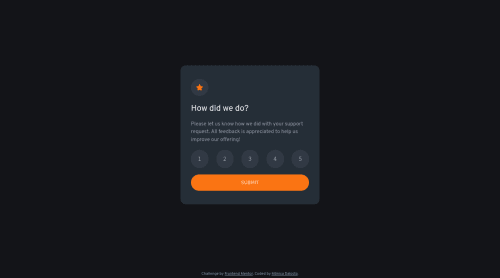
Submitted over 3 years agoA solution to the Interactive rating component challenge
Interactive rating component using JS

@MonicaDalosto
Solution retrospective
Hey Folks, I've just finished my first project using Javascript, and I'd really appreciate any feedback to help me improve my code. I've tried to use a bit of Utility First CSS concepts. What do you think about it? How can I improve or make my code more advanced... I am open to any other suggestions. Thanks in advance!!!
Code
Loading...
Please log in to post a comment
Log in with GitHubCommunity feedback
No feedback yet. Be the first to give feedback on Mônica Aparecida Kerber Dalosto's solution.
Join our Discord community
Join thousands of Frontend Mentor community members taking the challenges, sharing resources, helping each other, and chatting about all things front-end!
Join our Discord