Interactive Rating Component using React and CUBE CSS Methodology

Solution retrospective
I’m most proud of getting back into coding after a long break and successfully completing my first full React project while following best practices. It took me quite awhile to get started again, trying to refamiliarize myself with every aspect of creating an app and learning new updates.
Despite being rusty, I was able to apply clean, scalable, and reusable code principles to the best of my abilities, while ensuring the project was accessible and responsive.
I also took great care in implementing semantic CSS variables, CSS Modules, and utility classes, which made styling more maintainable. Additionally, handling state management properly and improving the app's UX (such as refreshing on back navigation) were things I’m particularly proud of.
Next time, I’d like to improve my efficiency by planning component structures earlier, so I don’t have to refactor mid-way. I also want to speed up debugging and troubleshooting by improving my console logging and Chrome DevTools usage to identify issues faster.
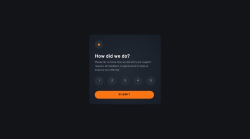
What challenges did you encounter, and how did you overcome them?Component Structure & State Management
- Initially, I wasn’t sure where state should live, especially when structuring the
Card,RatingGroup, andButtoncomponents. Through debugging and discussions, I ensured state lived at the correct level (App.jsx), and thatpropswere passed efficiently.
Ensuring the Rating Selection Stayed Active
- At first, the selected rating wasn’t persisting visually. The color that denotes a rating has been selected goes away after clicking on it. The issue came down to ensuring
propswere correctly passed and the selected state was properly linked to the component’s styling. After debugging, I corrected theselectedRatinglogic and applied conditional styling properly.
CSS Styling Challenges & Matching Figma Design
- One of my biggest personal goals was getting pixel-perfect precision in styling, which meant interpreting the Figma design correctly (especially gradients and spacing). I improved my gradient accuracy after troubleshooting and refined spacing using a custom spacing system.
Ensuring the "Back" Button Works as Expected
- Initially, using the browser's back button didn’t return the user to the rating screen as expected. Instead, the user must click the refresh button to return to the rating screen. I solved this by implementing a
useEffectlistener for thepopstateevent, ensuring that navigating back resets the rating state properly.
Understanding useMediaQuery for Dynamic Layouts
- Since the desktop design had inconsistent padding compared to mobile, I needed a way to conditionally switch styles. I implemented a custom
useMediaQueryhook to detect screen width and dynamically apply the correct styles.
While I’m proud of using a mix of utility classes, CSS Modules, and semantic variables, I’d love feedback on how to better structure global vs. component-specific styles in future projects.
Also, I realized I sometimes took longer than necessary to debug simple issues, such as props not being passed correctly. I’d like to refine my use of console logs, Chrome DevTools, and breakpoints to speed up issue resolution.
While I implemented proper state management and event handling, I’d love to learn if there are more efficient ways to handle conditional rendering, event handling, and prop management.
Although I followed ARIA best practices where needed (such as labeling buttons), I want to ensure my projects are as accessible as possible.
Any and all feedback is greatly appreciated! Thank you!
Please log in to post a comment
Log in with GitHubCommunity feedback
No feedback yet. Be the first to give feedback on Vivian's solution.
Join our Discord community
Join thousands of Frontend Mentor community members taking the challenges, sharing resources, helping each other, and chatting about all things front-end!
Join our Discord