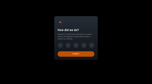
Hi
There are still quite a few issues in this, but it is much improved from before.
I recommend reading up on modern-css.dev about how to accessibly style radio inputs. What you've got at the moment is not accessible and is far more complicated than it needs to be.
I also see issues with how you are using explicit heights and widths; and margin/padding.
This component should not have a height or width. Just a max-width in rem. NO height at all. Let the browser dictate the height needed based off the content inside.
With padding and margin, remember the box model and keep it simple. All elements inside the component don't touch the edge of the box. So use padding on that box - padding is for internal spacing and does not collapse. For the elements inside the box (heading, paragraph, form...), you want to create space between those elements, so use vertical margins - margin is for external spacing and does collapse.
The other point which I think has been raised above is how to center your component on the page. Don't use huge margins. Use flex/grid properties along with min-height 100vh on the wrapping element to center it's contents on the screen.
All the relative/absolute positioning is unnecessary on this. You may use some for the radios but the markup structure would need to change first (see that article I mention above)
/* ratingcomponent.css | https://www.clewisdev.com/FMinteractiveratingcomponent/ratingcomponent.css */
section {
/* width: 327px; */
/* height: 360px; */
/* margin: 0 auto; */
/* margin-top: 9.625rem; */
max-width: 20.4rem;
margin: 1rem; // stop component hitting screen edges
padding: 2rem;
}
body {
min-height: 100vh;
margin: 0;
padding: 0;
display: grid;
place-content: center;
}
.star {
/* position: relative; */
/* top: 1.5rem; */
/* left: 1.5rem; */
/* margin-bottom: 1.875rem; */
margin-bottom: 1rem;
display: block;
}
.title {
/* padding-left: 1.5rem; */
}
.subtitle {
/* padding-top: .4375rem; */
/* padding-left: 1.5rem; */
/* padding-right: 1.5rem; */
margin-top: 1rem;
}
.input-div {
/* padding-left: .5rem; */
margin: 1rem 0 2rem;
}
[type="radio"] {
note: this is not how you accessibly hide inputs! opacity 0 is not right;
note: needs required attribute on one radio in html to prevent submit before completion;
clip: rect(1px, 1px, 1px, 1px);
clip-path: inset(50%);
height: 1px;
width: 1px;
margin: -1px;
overflow: hidden;
padding: 0;
position: absolute;
}
[type="radio"] + label {
note: wrap the input in the label and style the label;
}
label {
/* margin-top: .5rem; */
/* margin-bottom: 2rem; */
}
[type="radio"] + label::before {
/* content: ''; */
/* position: absolute; */
/* left: -16px; */
/* top: -14px; */
/* width: 42px; */
/* height: 42px; */
}
.submit-btn {
/* position: relative; */
/* left: 2rem; */
/* width: 85%; */
/* margin-bottom: 2rem; */
width: 100%;
}
Marked as helpful
@casserole27
Posted
@grace-snow Thanks again for taking the time for all these extensive notes, I really appreciate it.
After changing the code: In general, I don't understand how this is going to work with the design parameters that are given in Figma. This is why I usually use explicit sizing because I can't get anything else to work. When I apply what you have here, it works fine for the mobile sizing, but it doesn't work for the desktop sizing. The design parameters and files state that the mobile width is 327px, and the desktop is 412px. When I apply max-width 20.4 rem and min-height: 100vh, the width stays the same whether I am working on mobile or desktop sizing within the browser. However, it does seem to fluctuate better if I remove box-sizing: border-box, but it still isn't those exact sizes. So, what am I doing wrong?
I'm not understanding the radio button styling quite yet, or the padding and margin, I will take a deeper dive into those to make sure I understand.
Do you mean moderncss.dev? Do you have any other resources for CSS best practices? I think it can be difficult because it seems like there are so many ways to do the same thing in CSS. The radio button styling that I did came from a YouTube video. It has been a while since I have been through any sort of CSS tutorial or class and it looks like maybe I could use an update. I have never seen some of these selectors before, nor have I seen display grid / place content center. Do you have any experience with or thoughts about Scrimba's program? Thanks again!
@casserole27 Yes, I strongly encourage you to dive more into this. What you have currently is inaccessible and not fully responsive. It needs to be able to adjust and it needs to work (and have visible indicators) for keyboard users.
You must never limit the height of components containing content, and should be using max-width not width so they can shrink when needed.
The design is a static representation on a larger phone, but would still need to work down to 320px wide without any horizontal scrolling / overflow. It's up to us as frontend developers to decide how that should happen. I would allow the card to shrink down, make the flex gap between items small and use justify content to then spread them out when there is room.
Marked as helpful
@casserole27
Posted
@grace-snow Thanks again, this is so helpful. Thank you for taking the time.
This gives me a plenty of notes and things to try, will only increase my understanding of CSS, and I'll keep updating the project until it's a best practice. I've been playing with the max-widths more today, it makes more sense, and it seems so much better than working with the explicit dimensions.