


CyrusKabir• 1,885
@CyrusKabir
Posted
Hello my dear friend ♥ you did good on this challenge and here some improvements for your component :
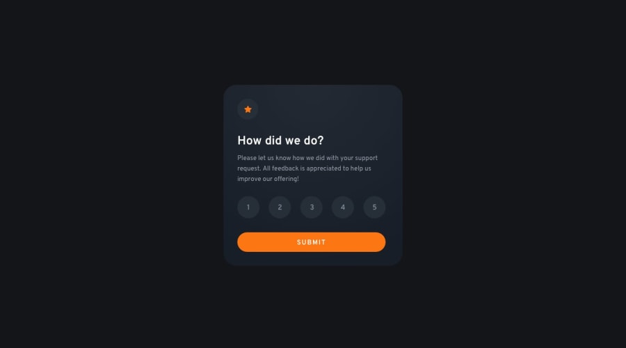
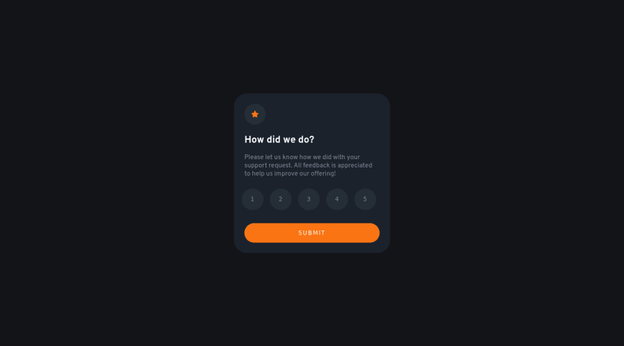
- there is some mistake in your active states that orange background is for hover state and gray one is for active or selected rating
- adding more line-height to body tag can make texts more readable
- using or getting familiar with one class naming convention in css is very good and can make your life easier with both html, css try something like BEM or anything like that
- you can use comparison slider tool on net or use Perfect Pixel extension for having closer result to main design. good luck ☻♥
Marked as helpful
1
Mustafa Tüfekçi• 50
@mustafa-tufekci
Posted
@CyrusKabir thank you for feedback. on next challenges I will try to keep on mind your advices.
1
