
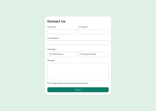
Solution retrospective
i created custom radio buttons and checkbox, was hard but i did it.
What challenges did you encounter, and how did you overcome them?creating custom radio and checkbox was a real headache, but i by using different references and resources i overcame.
What specific areas of your project would you like help with?how i can make form more interactive ?? js is a mystery can always be improved. How can i check when user is inputting data weather it is valid or not and show an error ???
Please log in to post a comment
Log in with GitHubCommunity feedback
- @thisisharsh7
Fantastic work! Great job using references to overcome challenges while adapting solutions to your code.
To make the form more interactive and improve validation:
- Real-time validation: Add event listeners for
inputevents to check data as the user types. For example:
   firstName.addEventListener('input', () => {
     firstName.nextElementSibling.classList.toggle('hidden', firstName.value.trim().length >= 4);
   });
This shows/hides errors instantly.
-
Visual feedback: Add a green border or checkmark for valid inputs using a class like
.valid { border-color: var(--color-green-600); }. -
Disable submit button: Disable the button until all fields are valid using
button.disabled = !isValid;. -
Responsive improvements: Use rem for padding/margins (e.g.,
padding: 1rem) and media queries to adjust.wrapperwidth for smaller screens.
Good work overall-Keep experimenting!
Marked as helpful - Real-time validation: Add event listeners for
- @MarziaJalili
You're crashing it! 🔥
🌟 Tweaks?
✅ You could simply use the property below for the radio buttons and checkbox to change the color instead of building everything from scratch yourself:
accent-color: green;✅ On mobile, the size and position of the success box are a bit off, bro. Like we hit the submit button, waiting for something to pop up, but nothing is there unless we scroll back to the top.
✨ Here's how to fix this:
-
set the width to a larger number to avoid too match stretching.
-
change absolute positioning to fixed to make it show up all across the page.
-
we will add a nice little animation for better user experience. 😀
width: 94%;
position: fixed;
/* Fun stuff */
transform: translateY(-10%);
opacity: 0;
transition: 1s;
animation: pop-up 1s ease-in 1 forwards;

@keyframes pop-up {
  to {
    opacity: 1;
    transform: translateY(0%);
  }
}
Other than that, the code is just flawless!
😎😎😎
Marked as helpful -


Join our Discord community
Join thousands of Frontend Mentor community members taking the challenges, sharing resources, helping each other, and chatting about all things front-end!
Join our Discord