Submitted over 2 years agoA solution to the Interactive pricing component challenge
Interactive-pricing-component

@mohamedyasser27
Solution retrospective
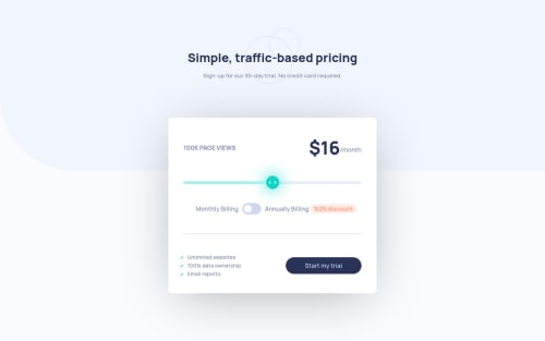
this one was hard because i couldn't do the progress the bar but using css custom variables along the input event allowed me to create a script that tracks the progress
but a problem i had was the resizing which made the range break so i had to using resize observer to keep it consistent but i don't think it's the right approach but i couldn't come up with a formula in css that doesn't make the progress bar exceed the button on resize
Code
Loading...
Please log in to post a comment
Log in with GitHubCommunity feedback
No feedback yet. Be the first to give feedback on mohamed yasser amer's solution.
Join our Discord community
Join thousands of Frontend Mentor community members taking the challenges, sharing resources, helping each other, and chatting about all things front-end!
Join our Discord