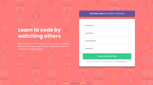
Intro Component with Signup Form using Flexbox

Solution retrospective
Is there any way to implement this design without using the placeholder attribute?
Please log in to post a comment
Log in with GitHubCommunity feedback
- @antarya
Hi 👋,
Excellent work on this challenge 🚀. It looks fantastic on different screen sizes.
[1. Regarding your question. You can use a label on top of the input, and when the input is focused, either hide or move the label to a different place. You can check the real example here https://mui.com/material-ui/react-text-field/#basic-textfield; inspect input to see all elements.
[2. While using the screen reader, the input error is read only once. Later, if you focus on input with an error, there is no indication that the input is invalid. Using
aria-invalidandaria-errormessageoraria-describedbymight help with it https://developer.mozilla.org/en-US/docs/Web/Accessibility/ARIA/Attributes/aria-errormessage.[3. Submit event listener is added for each input; is it intentional?
[4. When input text is long, and the error icon is visible, the text overlaps with the icon. Increasing padding on the right side will help to fix it.
I hope this will be helpful.
Keep up the good work 🚀. Cheers!
Marked as helpful

Join our Discord community
Join thousands of Frontend Mentor community members taking the challenges, sharing resources, helping each other, and chatting about all things front-end!
Join our Discord