


@Aadv1k
Posted
Hey! Even I just completed this challenge, great work, but the mobile spacing is a bit off Also, a quick tip, you should use absolute positioning in the "Made by ____" this will prevent that scroll
@tea-scripts
Posted
@Aadv1k Thanks for the review mate!
- If you could provide more details about the "mobile spacing is a bit off" cause Looking at the page on a mobile phone or in developer tools mobile view nothing seems to be off asides from the overlay which I'm still going to change.
- In regards to the attribution, for me I think it's okay to have it outside of the screen and only show it if the user scrolls. Although on my mobile phone the whole page is displayed without a scroll bar.
Here's a screenshot of my mobile view. Is it different from yours?
@Aadv1k
Posted
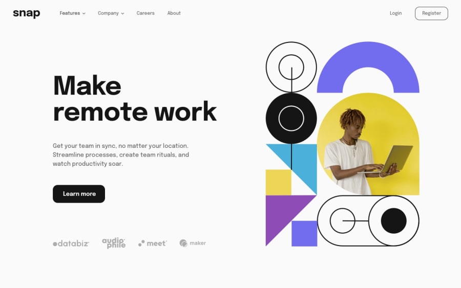
@tea-scripts Hey, by mobile spacing is a bit "off" I meant the company list on mobile looks a bit dense, So I would recommend changing the images' width, your implementation looks really great so this is just a small change to make it even better; aplogies for the confusion due to my not-so-detailed reply
@tea-scripts
Posted
@Aadv1k Ahh you're referring to the svgs for the clients in the hero section? If yes, I'll reduce the sizes cause yes they sure look dense.
The project isn't complete yet. I just built it to refresh my knowledge on React and I still have a lot of refactoring to do, notwithstanding thanks for the feedback I sincerely appreciate it.
