Skip to content
  • Unlock Pro
  • Log in with GitHub
Solution
Submitted about 3 years ago

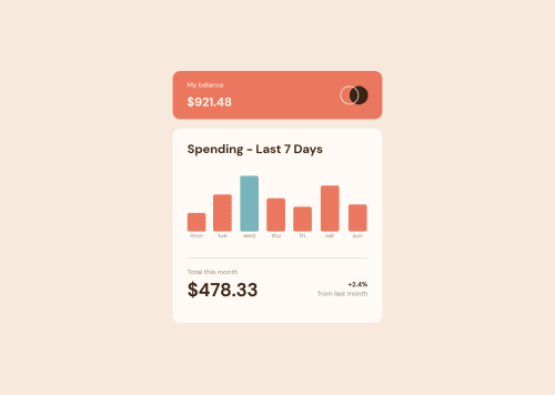
Javascript Generated Graphs

fetch, sass/scss
brainwins•80
@brainwins
A solution to the Expenses chart component challenge
View live sitePreview (opens in new tab)View codeCode (opens in new tab)

Solution retrospective


Which rules do you follow on when to use rems, %, or vws?

How low of a width resolution should I target?

Code
Select a file

Please log in to post a comment

Log in with GitHub

Community feedback

  • Chris Psilocybin•1,185
    @xphstos
    Posted about 3 years ago

    Hey there! First of all, great work on your solution!

    My approach on using the "correct" unit is based on accessibility. That's why I usually go for rem / em. I never mess with the default rem to pixel value and that leaves me with 16px to be equal with 1rem. That also helps me because in all of my design I use the 8point grid system. You can read more on that here. Not only I have a better/easier way to calculate all my margins/paddings but it's also pretty much accessible. As I mentioned in most browsers the default value of 1rem is 16px. A visually impared user it's pretty much likely to change that value to a bigger one, like 18 or 20. That change immediatelly reflects in all aspects of my design not only in fonts. Every padding and margin will scale up and I get to keep my design's cohesion.

    Percentages are useful in many cases, in this example a case for percentages would be the graph bars. You set the chart's height to a fixed value like 12.5rem or 200px and then use percentages in bar's height. Based on max value in dataset being the 100% height and the rest are calculated accordingly...

    As for what's the lowest screen resolution you need to test your design, a safe option is to go as low as 320px. The old iPhone SE uses this resolution. Android phones using this resolution are way way too old to be "alive" and working but I've seen many people using that iPhone model. A "modern" resolution is 375px and the greatest and latest models from Samsung / iPhone / Huawei etc. are using 425px or close to that.

    It's not like we're supporting browsers like IE but damn we could go as low as 320px 😛 So 320px is a bit low but pretty inclusive I should say.

    Marked as helpful
  • Akhlak Hossain Jim•1,325
    @Akhlak-Hossain-Jim
    Posted about 3 years ago

    Great work so far. Everything looks good on the website.

    Here is some of my suggestion,

    1. I found % is best for this kind of scenario where calculation involved
    2. and for the resolution, you should consider using relative values like em, rem, and more or you can use CSS functions like min(), max(), minmax() check this and this resources for reference.
    3. check for typos in code like sectiom

    Keep coding everything just need a bit practice. Happy coding :).

Join our Discord community

Join thousands of Frontend Mentor community members taking the challenges, sharing resources, helping each other, and chatting about all things front-end!

Join our Discord
Frontend Mentor logo

Stay up to datewith new challenges, featured solutions, selected articles, and our latest news

Frontend Mentor

  • Unlock Pro
  • Contact us
  • FAQs
  • Become a partner

Explore

  • Learning paths
  • Challenges
  • Solutions
  • Articles

Community

  • Discord
  • Guidelines

For companies

  • Hire developers
  • Train developers
© Frontend Mentor 2019 - 2025
  • Terms
  • Cookie Policy
  • Privacy Policy
  • License

Oops! 😬

You need to be logged in before you can do that.

Log in with GitHub

Oops! 😬

You need to be logged in before you can do that.

Log in with GitHub

How does the accessibility report work?

When a solution is submitted, we use axe-core to run an automated audit of your code.

This picks out common accessibility issues like not using semantic HTML and not having proper heading hierarchies, among others.

This automated audit is fairly surface level, so we encourage to you review the project and code in more detail with accessibility best practices in mind.

How does the CSS report work?

When a solution is submitted, we use stylelint to run an automated check on the CSS code.

We've added some of our own linting rules based on recommended best practices. These rules are prefixed with frontend-mentor/ which you'll see at the top of each issue in the report.

The report will audit all CSS, SCSS and Less files in your repository.

How does the HTML validation report work?

When a solution is submitted, we use html-validate to run an automated check on the HTML code.

The report picks out common HTML issues such as not using headings within section elements and incorrect nesting of elements, among others.

Note that the report can pick up “invalid” attributes, which some frameworks automatically add to the HTML. These attributes are crucial for how the frameworks function, although they’re technically not valid HTML. As such, some projects can show up with many HTML validation errors, which are benign and are a necessary part of the framework.

How does the JavaScript validation report work?

When a solution is submitted, we use eslint to run an automated check on the JavaScript code.

The report picks out common JavaScript issues such as not using semicolons and using var instead of let or const, among others.

The report will audit all JS and JSX files in your repository. We currently do not support Typescript or other frontend frameworks.

Oops! 😬

You need to be logged in before you can do that.

Log in with GitHub

Oops! 😬

You need to be logged in before you can do that.

Log in with GitHub