


@pikapikamart
Posted
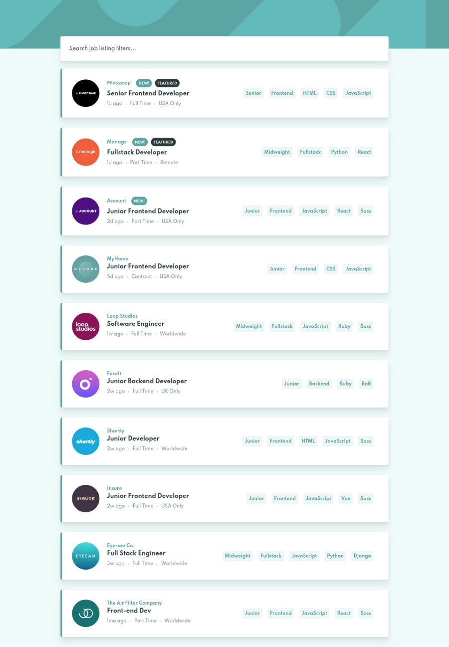
Hey, another awesome solution on this one and really nice about that addition of the search bar! Desktop layout looks really nice, site is responsive and the mobile state looks really nice as well.
For that part about the searchbar, have you though about doing it like:
<div class="input-container">
    <ul>
    </ul>
    <div class="searchbar__container">
      <input id="search-bar" type="text" placeholder="Search job listing filters..." autocomplete="off">
    </div>
</div>
The .input-container will be flexbox and the searbar_container will be using flex-basis: 100% and the input will be width: 100%. This way, user can click in all remaining space of the searchbar and also, putting the input inside the ul is not ideal because it will already announce an item in the search-bar even if the user hasn't already searched anything that's why separating it from the ul would be better. The tricky part in this however when the search-bar is almost filled up where the input needs to be wrapped in another row.
Some other suggestions on the site would be:
headeris not needed in here since there are no primary heading content that are available. Using onlymainin here is enough.h1in here should not be used in a single item in those list. Theh1is this layout will be better if it was screen-reader only heading tag inside themainwith a text describing what is the main-content is all about.- For the search-bar as well, you could use this markup:
<section aria-labelledby="searchbar">
  <h2 id="searchbar" class="visually-hidden">Search and filter bar</h2>
</section>
Section by itself is not informative so adding that aria-labelledby which points to a screen-reader only heading tag inside it will help a user to quickly navigate on it via landmark.
- For the search-bar dropdown, you should place it after the
inputtag. - Since there is list of available search item where a user can choose upon, it would be nice to make it a
combobox. The idea is that since you are controlling the search item:
- The
comboboxwill own the list of possible search items viaaria-owns={id of ul} - Using
aria-expandedoncomboboxif the user navigates in the search-bar so that user can quickly select the items. In this case, you need to support using arrow keys, up and down key to select items and when a user types, setting totruethe attribute and showing the dropdown items so that user will be informed. - Adding
aria-haspopup="listbox"on thecomboboxsince it will show the dropdown. - The
inputwill be usingaria-activedescendant={id of the list option}this way, screen-reader will instead refer to the element that is being active instead of giving focus on the element. Sounds a bit confusing:> - The
ulof the dropdown will have anidthat will be referenced by the combobox'saria-owns. In some cases, thearia-activedescendantis placed in here but since you are usinginputand is more suitable at the moment. - Each
ulliwill haverole=optionand a default ofaria-selected="false"and will be set to true if user does something like use arrow-key and when the focus is on the option, you will set it to true.
The markup would look something like:
<div role="combobox" aria-expanded="false" aria-owns="searchbar-dropdown" aria-haspopup="listbox">
  <label for="searchbar" class="visually-hidden">Search job listing filters</label>
  <input type="text" aria-controls="searchbar-dropdown" id="searchbar" aria-activedescendant>
</div>

<ul role="listbox" id="searchbar-dropdown"> # I think tabindex="-1"` is needed?
  <li role="option" aria-selected="false" id="search-one">Search One</li>
  ....
  ....
</ul>
When the user types in the input and a dropdown-item matches it, set aria-expanded="true", then when user uses the arrow key, (up and down), focus on the items in the dropdown.
For every key event of the user when selecting an option, you will need to set the option's id as the aria-activedescendant value to give focus on it and set the current option to aria-selected="true". You can use .nextElementSibling and .previousElementSibling on this since it will be much easier and faster.
For now this might seem ambiguous since I don't have a direct snippet of it, my rest-api-country uses listbox but not like this since you are using a search bar.
So that is just a suggestion on the search-bar, feel free to search about role="combobox for further clarification.
Right now, those only since going to rest now, it's Sunday!
Again, really nice work on this.
Marked as helpful
