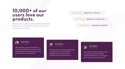
Submitted almost 5 years agoA solution to the Social proof section challenge
[Junior Dev] Grid Layout | 7-1 SCSS + BEM

@HailoMYM
Solution retrospective
This is my second challenge and I tried to improve the quality of my code using scss and the 7-1 architecture. I also applied BEM naming convention in order to have a better structure for my classes.
I am still looking the way to have pixel perfect design like many others, even I have access to the sketch file I could not figure it out how to have the right margins/paddings.
Code
Please log in to post a comment
Log in with GitHubCommunity feedback
- @ezraguy
Hello HailoMYM, the design looks great! awesome job! but I do have 2 suggestions:
- At 959px width the stars start to break so i would add a min-width like this:
@media only screen and (min-width: 769px) .rating__star { margin-bottom: 0; -webkit-box-flex: 1; -ms-flex: 1 0 120px; flex: 1 0 120px; min-width: 135px; }- I loved the way you organized the cards without margins only with align-self but around 880px width their height starts to change because the amount of text in each card is different and they look uneven. if you will remove the align-self for the first and last card at the (min-width: 769px) media query and add a height of 90% to all they will look even.

Join our Discord community
Join thousands of Frontend Mentor community members taking the challenges, sharing resources, helping each other, and chatting about all things front-end!
Join our Discord