Not Found
Not Found
Not Found
Not Found
Not Found
Not Found
Not Found
Not Found
Not Found
Not Found
Not Found
Not Found
Not Found
Not Found
Not Found
Not Found
Not Found
Not Found
Not Found
Not Found

Submitted

Just learned after and before pseudo

Sarbehβ€’ 100

@herbras

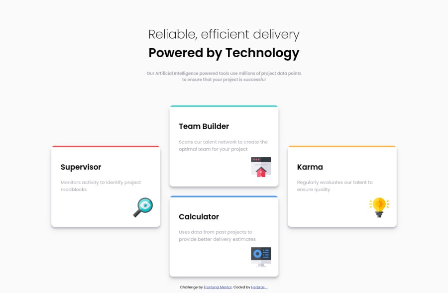
Desktop design screenshot for the Four card feature section coding challenge

This is a solution for...

  • HTML
  • CSS
1newbie
View challenge

Design comparison


SolutionDesign

Solution retrospective


Update soon. I know it's bad , i will update and fix these.

Community feedback

drallasβ€’ 375

@Drallas

Posted

Hello Ibrahim

On a wide screen over around 1535 px the four cards end up horizontally aligned. i think a max width on .section can prevent that. There are 2 more 'breaks' going from desktop to mobile, i don't know if i like them, myself i opted for just one break since a tablet layout was not required. https://drallas.github.io/Four-card-feature-section/.

Good look with the refactoring this solution..

1

Sarbehβ€’ 100

@herbras

Posted

@Drallas Ok.. Thank you Drallas.

0

Please log in to post a comment

Log in with GitHub
Discord logo

Join our Discord community

Join thousands of Frontend Mentor community members taking the challenges, sharing resources, helping each other, and chatting about all things front-end!

Join our Discord