just plain html and css

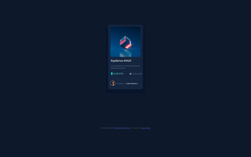
Solution retrospective
constructive criticism is appreciated.
Please log in to post a comment
Log in with GitHubCommunity feedback
- @riverCodes
Hi, congratulations on the solution. Here are a few things you can improve on, -
-
For the HTML and Accessibility issues, put alt attributes on your images and icons. Change your div.main-container to main.main-container (
<main class="main-container>). Whenever you use a section, it needs to have one heading element inside it, and the whole page needs to have at least one <h1> tag. -
I noticed your card is not centered on the page. For this, i recommend this resource. It's a great standard way that you can use to center a lot of the components in the frontend mentor challenges. Link: https://every-layout.dev/layouts/cover/. In short, you want to put this CSS in your body tag:
min-height: 100vh, display: flex; flex-direction: column; align-items: center; justify-content: center;This will force your <body> tag to cover 100% of the viewport height (by default, element heights usually depend on inner content height). and then use flexbox to apply centering properties. -
additionally, you can apply this code to your <main> tag
margin-block: auto;and to the <footer>margin-block-start: 1remthis will force your footer tag to always have 1rem of space from the main tag and will keep the main tag centered vertically. -
Lastly, your design seems to be quite smaller than the reference. I suggest you to use rem units instead (relative to the font-size mentioned in the style-guide.md) and bump up the sizes of everything. Small text is more for printing, on screens this affects readability.
Good job though :D Keep on learning!
Marked as helpful -

Join our Discord community
Join thousands of Frontend Mentor community members taking the challenges, sharing resources, helping each other, and chatting about all things front-end!
Join our Discord