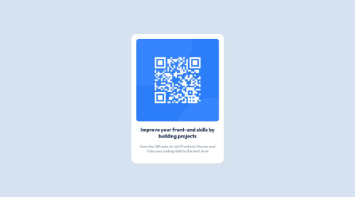
Just the basics of HTML and CSS were used

Solution retrospective
Picking the right font-size to match the first main text
Please log in to post a comment
Log in with GitHubCommunity feedback
- @Blackpachamame
Greetings! you have done a great job 😎
📌 Some accessibility and semantics recommendations for your HTML
- To improve the semantics of your HTML, you can change your
<div class="attribution">to a<footer class="attribution"> - I think that in this case it is not correct to use
figureandfigcaption. But I'll leave that to your discretion - You can apply
display: blockto the image to remove the white space generated underneath. Although visually in this case it is irrelevant, it helps you better calculate the space with other elements - Instead of using
marginto center your content in the center of the screen, you can use theflexboxproperties in thebody:
body { background-color: hsl(212, 45%, 89%) min-height: 100vh; display: flex; justify-content: center; align-items: center; flex-direction: column; gap: 20px; /* Separate the main from the footer */ }Marked as helpful - To improve the semantics of your HTML, you can change your
Join our Discord community
Join thousands of Frontend Mentor community members taking the challenges, sharing resources, helping each other, and chatting about all things front-end!
Join our Discord