


@ApplePieGiraffe
Posted
Hey there, MetisT! 👋
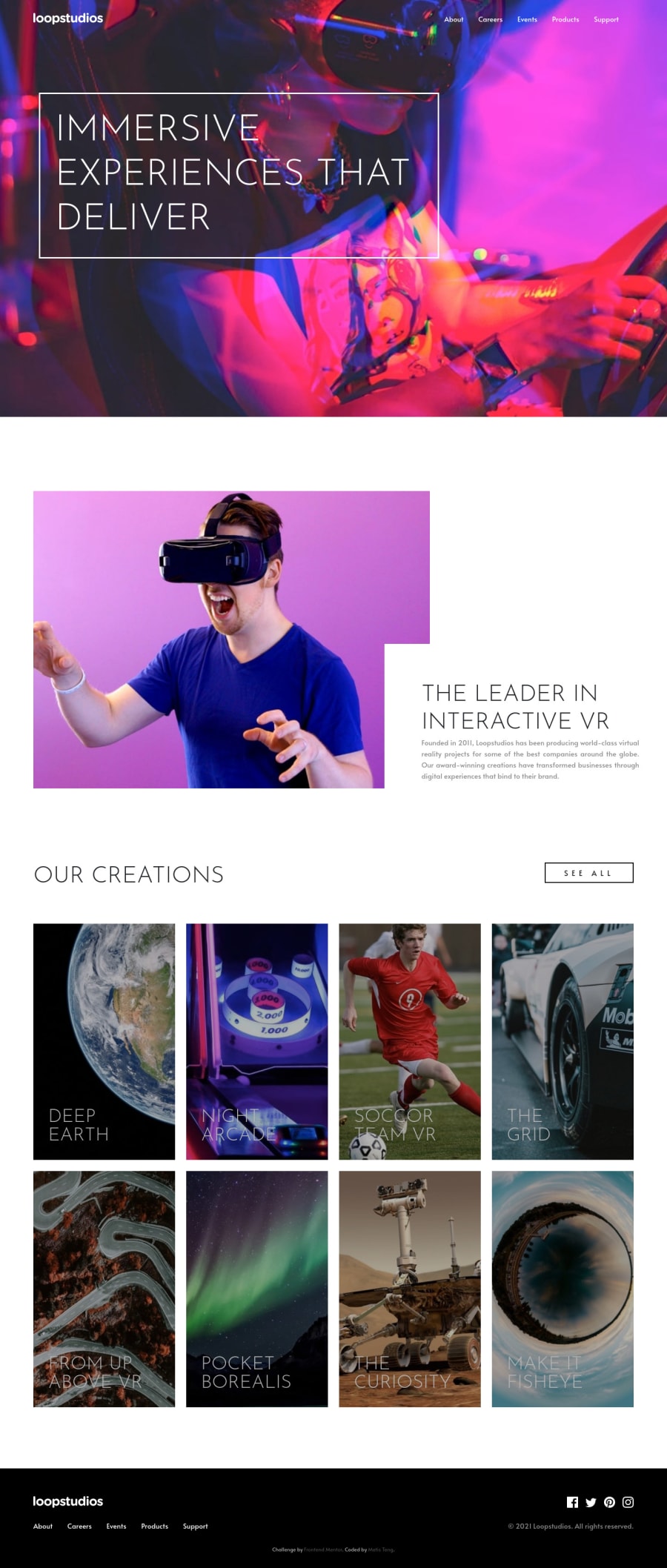
Good effort on this challenge! 👏 It definitely is very important to look carefully at the mobile and desktop designs of a challenge in order to plan out how you are going to build a website and make it responsive! 😀
I suggest,
- Taking a look at your solution report and trying to clear up some of the errors that are there. You should add some
alttext to the images to make your solution more accessible and clear up some of the errors that are there. - Considering using CSS grid to lay out the cards in the "Creations" section. It really seems like a good opportunity to use CSS grid (which is a wonderful, powerful layout tool) and should help you fix some issues such as the cards becoming very large at around 980px.
- Darkening the background of the hero section of the page so that the text content in that section stands out better against the background (as in the original design).
Hope those tips help. 👍
Best of luck in your job hunt! 🙂
Keep coding (and happy coding, too)! 😁
@greatmetis
Posted
@ApplePieGiraffe Thank you very much! Your suggestions are really specific and helpful! I have fixed them, and through your thoughts I even found the details I didn't follow the prototype namely background filter for the images in the section of "creations." I also believe the insights you offered are what I need to practice in the future design ;) Thank you again!
Many loves to this community♥️ Great to know front end world too😊
@ApplePieGiraffe
Posted
@greatmetis
Hey, no problem! 👍 Glad to help! 😄

