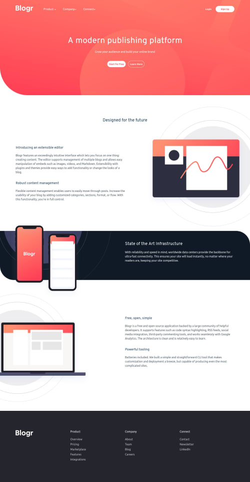
Landing page with using flexbox and grid + vanilla JavaScript

Solution retrospective
I would appreciate any feedback from you guys. My CSS is a mess LOL
Please log in to post a comment
Log in with GitHubCommunity feedback
- @pikapikamart
Hey, awesome work on this one. Desktop layout looks fine just a little shorter than the design, the site is responsive though and the mobile state looks great.
To be honest, I still find this challenge really hard so bear with me on this one:>
- For this one, I would prefer to only use
headerfor the topmost part that includes the navbar. Theheaderwould beposition: absoluteonto the top part so that your first section of themaincould occupy those spacings up top and still creating that background-image. The reason that I only include the navbar inside theheaderand not those text on the hero-section is because the primaryheaderis typically reused on different pages since it includes the link, by including those text inside theheaderyou won't be able to do this right. - I wouldn't include the header-logo inside the
navsince it is not being treated as a link, if you somehow useatag to wrap the logo, then you can include it, but remember to label theatag properly on where the link would take the user. - Those 3 items,
product ,company, connectshould be abuttonand not a link because the items on the dropdown per category are the ones that should be links.
- ( Hide img element: Decorative images should be hidden for screen-reader at all times by using
alt=""andaria-hidden="true"to theimgtag or onlyaria-hidden="true"if the image is usingsvg.)
- The arrow-icon per category should be hidden, use method number 1. A more proper markup per category looks somewhat like this:
<nav>
 <ul>
  <li>
    <button class="button__product aria-expanded="false">Product</button>
    <ul class="category__product>
      { links in here }
    </ul>
  </li>
 </ul>
</nav>
Then you could just something like:
.category__product {
  display: none;
}

.button__product[aria-expanded="true"] + .category__product{
  display: none
}
As you can see, you should use the
aria-expanded="false"as default attribute on thebuttonand it will be set totrueby javascript if the user toggles thebuttonand vice-versa.learn moreis better to useatag rather thanbuttonsince it looks more a page link rather than a modal right.
FOOTER
- Use a more proper
altvalue for the website-logo. - Those links could have been inside a
navelement since those are still your website's navigational links. - Also, same as the markup that I proposed earlier, you could use
ulinside thenavand eachliwould be its own category. The firstliwould wrap the the product category and so on.
MOBILE
- Hamburger menu should be using a
buttonsince it is an interactive component.
SUPPOSING BUTTON IS USED
- The
buttonshould have a default attribute ofaria-expanded="false"and it will be set totruewhen the users toggles it and vice-versa. - The hamburger
buttonshould have eitheraria-labelattribute orsr-onlytext inside it which defines what thebuttondoes. You could usearia-label="navigation dropdown menu"as the text-value. - The
imginside the hamburger-menu should have been hidden properly by addingaria-hidden="true"on it.
Aside from those, great job again on this one.
Marked as helpful - For this one, I would prefer to only use

Join our Discord community
Join thousands of Frontend Mentor community members taking the challenges, sharing resources, helping each other, and chatting about all things front-end!
Join our Discord