Not Found
Not Found
Not Found
Not Found
Not Found
Not Found
Not Found
Not Found
Not Found
Not Found
Not Found
Not Found
Not Found
Not Found
Not Found
Not Found
Not Found
Not Found
Not Found
Not Found

Submitted

Loop studios landing page

P
AndyBeable• 120

@AndyBeable

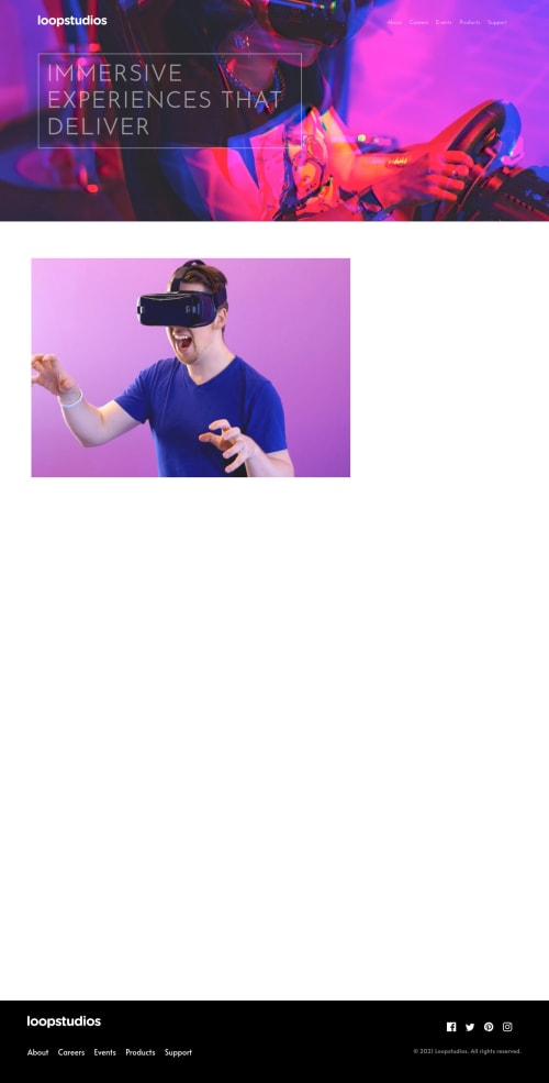
Desktop design screenshot for the Loopstudios landing page coding challenge

This is a solution for...

  • HTML
  • CSS
  • JS
2junior
View challenge

Design comparison


SolutionDesign

Solution retrospective


Hi all,

A bit of a love/hate relationship with this one! There are a lot of areas I think I could improve. In particular the responsive mobile nav. I've managed to get it working (though i'm sure there's a much better way)!

Would be great to get some tips on how to do the following, as these are parts I've been going round in circles on:

  • Hover underlines on links in main nav and footer. I did manage to get this working, but for some reason the line would only show up in one place, not under each link. So i've removed for now.
  • Would like to add some hover states to the creations tiles, but again couldn't figure it out.
  • The 'See all' cta, on desktop, I wanted to move it to the top right of the section as per the design, but could only seem to do that using absolute positioning and then that caused issues when the screen-size changed.

Lots to improve!

Community feedback

Loris Bettazza• 345

@Pustur

Posted

Hey Andy,

Hover underlines on links in main nav and footer. 
I did manage to get this working,
but for some reason the line would only show up in one place, not under each link. 
So i've removed for now.

Sounds like you positioned the lines with position: absolute; but the links didn't have position: relative;? So they were all relative to some other common parent element. If that's the case you should add position: relative; to your links.

Would like to add some hover states to the creations tiles, 
but again couldn't figure it out.

I did it using ::before and ::after, one was for a black gradient to improve readability of the white text, the other is a white overlay that shows up on hover/focus. I did this with the position: relative; in the parent and position: absolute; in the pseudo element.

The 'See all' cta, on desktop,
I wanted to move it to the top right of the section as per the design,
but could only seem to do that using absolute positioning and 
then that caused issues when the screen-size changed.

I used grid and the order property for this, I agree using position: absolute; can sometimes get messy.

Good work overall, I like the animations on scroll. (Too bad they mess up the screenshot 😅)

Check out my solution if you want to see how I did the things you asked about.

4

P
AndyBeable• 120

@AndyBeable

Posted

@Pustur thanks so much for taking the time to review my attempt and the pointers! Will have another run at it over the weekend :)

0
P
Grace• 27,350

@grace-snow

Posted

Hi Andy,

Looks like you've added an event listener to whole documemt instead of the hamburger (oops) ☺

Once you've fixed that, take another look about making that header accessible like

  • using an interactive element to open the nav
  • using aria attributes to tell tech what that element controls
  • alt logo - logo of what?

I haven't gone through all the code for an accessibility check but there's probably others. Just read through the html, see what you can spot, try to navigate using a keyboard and/or screenreader etc. Once you start getting into that mindset at the outset the more naturally it will come to you.

Good luck with it!

2

P
AndyBeable• 120

@AndyBeable

Posted

@grace-snow Thanks Grace! I was actually going to ask in the channel yesterday, whether there is any sort of 'checklist' you can use to make sure you've ticked off all the accessibility points for each html element? But thats a good point about using the keyboard etc! :)

0
P
Grace• 27,350

@grace-snow

Posted

@AndyBeable my favourite tool is called accessibility-insights. It's available as a chrome extension. As well as doing a 'fast pass' automated check for things like color contrast, ids etc (all the same stuff the report will pick up on here), it includes a handy tab stop visual indactor and a list of things to check manually.

A lot of accessibility stuff is just about thinking through things from different people's perspective though and no tool can do that, it just comes with time and experience

0

Please log in to post a comment

Log in with GitHub
Discord logo

Join our Discord community

Join thousands of Frontend Mentor community members taking the challenges, sharing resources, helping each other, and chatting about all things front-end!

Join our Discord