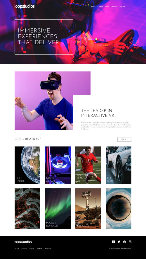
loopstudios landing page using react

Solution retrospective
- any feedback is welcome uwu
Please log in to post a comment
Log in with GitHubCommunity feedback
- @pikapikamart
Hey, awesome work on this one. Layout in desktop seems fine, the responsiveness could be better since right now, slowly changing the screens-width, some text are overflowing, the collections-card are not being wrapped in another row they are just getting squished until mobile breakpoint is reached. Mobile layout looks fine. But a major issue is, I suspect there are usage of
vhunits inheighton this one. inspect your layout in devtool at the bottom, you will see that the layout is getting destroyed.Some suggestions would be:
- Avoid using
height: 100vhon a large container like thebodytag as this limits the element's height based on the remaining screen's height. Instead usemin-height: 100vh, this takes full height but lets the element expand if needed. - A typical layout of a site looks like:
<header />
<main />
<footer />
This way, all element that has content are inside their respective landmark elements.
- Website-logo
imgshould be using the website's name as thealtlikealt="loopstudios". Remember that a website's logo is meaningful so always make sure it uses the properaltvalue. - Those 5 items should be a link since they are your website's navigational links. A proper markup for those is:
<nav aria-label="primary"> <ul> list of links in here </ul> </nav>- To be honest, there are lots of
%unit inheighton this one. As soon as I removed theheight: 100vhthe layout just got destroyed when viewing in dev tools at bottom. - This text
IMMERSIVE EXPERIENCES THAT DELIVERshould be a singleh1with amax-widthso that the text will wrap on their own and not usingdivandptag. - Second
imgcould use a betteraltsincevrguyis what? You could describe it properly likea man using vrsomething like that. - The bold text on the image's right side should be a heading tag.
OUR CREATIONSshould be a heading tag since it describes what the section will contain, hence the website's creations.see allshould be a link since on a real site, those would be a link that a user can go to "see all" creations.- Each of those creation card should have an
atag sitting inside it, since each card will be a link for a user to view. - You could have used as well a
ulon those since those are "list" of creations. Using afigureon those since every creation card text are thefigcaptionwhich can use aatag inside it. Have a look at my solution on this one see if you can get some markup ideas on this.
FOOTER
- When using
imgtag, don't forget to include thealtattribute, even if the value of it is empty or not. If you don't include this, screen-reader will read the source path of theimgwhich you don't want. So always include it. - Same for the website-logo it should use the website name as the
altvalue. - Your placement are wrong, the navlinks should be first before the social media. Use grid on this one to properly place the items.
- Social media links could be inside
ulsince those are "list" of links. - Each
atag that wraps social media, it should have eitheraria-labelattribute or screen-reader element inside it. The value for whatever method you will use should be the name of the social media likearia-label="facebook"on the facebook linkatag. This way, users will know where this link would take them. - Each
imginside the social media link should be hidden since they are only decoration so usealt=""and add extraaria-hidden="true"attribute on them. - Same goes for the navlinks, use the structuring that I stated above.
MOBILE
- Hamburger menu should be using a
buttonelement since it is a control. Again, interactive components uses interactive elements. By usingdivyou are making it not-accessible. - The
imginside the hamburger should be hidden, use the method I mentioned above about hiding elements.
SUPPOSING BUTTON IS USED
- The
buttonwill be using the method I mentioned usingaria-labelattribute or screen-reader element inside. The value will describe what does thebuttondo. The value could bearia-label="navigational dropdown menu". - The
buttonshould have a defaultaria-expanded="false"attribute on it. It will be set totrueif the user toggles thebutton. - Also, why create a component that replaces the whole content of the site when the button is toggled? Don't.
Now, learning some libraries like react is really great, but before doing it, make sure that you have a strong fundamentals about semantic html and proper usage of css, because right now, those are really missing in here. As a react developer or just a developer in general, the last thing you want to do, is to create a not accessible website.
But still, great job on this one.
- Avoid using

Join our Discord community
Join thousands of Frontend Mentor community members taking the challenges, sharing resources, helping each other, and chatting about all things front-end!
Join our Discord